Emerging paint trends are a wonderful starting point for those looking to change up their interiors. Following wider trends in decor, paint allows you to completely alter the feel of a room with a single colour, making your home more modern and current.
Although there are many paint colour trends to look out for, these warm pops of colour are the ones to choose for autumn-themed interiors.
Subtle reds
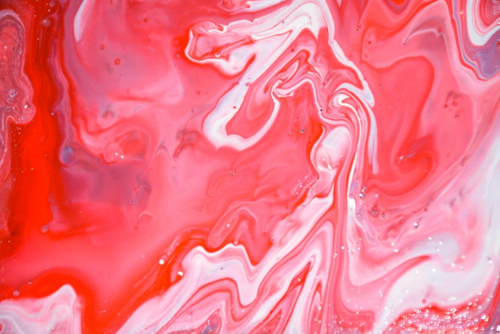
Briana Graham via Unsplash
Red is used sparingly in interior design and is considered a controversial colour. But this year, that perception is slowly changing. While designers aren’t jumping head-first into bright reds that can be jarring (and even stress-inducing), they are experimenting with subtle reds that allude to the trends of previous centuries. This historical element is one of the reasons why red has come back into the fold, paired with rich textures and vintage furniture. Subtle reds are also a quick way to warm up your space and perfectly match an autumn theme.
Bright citrus
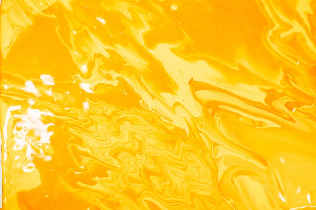
Luis Quintero via Unsplash
Following the bright colour trends of the year, yellow is back in. There are several shades gaining popularity, but one that stands out for autumn is citrus yellow. Citrus has a natural feel to it, with touches of green tones reminiscent of autumn falling leaves, that add a pop of colour without becoming overwhelming. For a more toned-down version of this colour, you can also try some of the golden yellows that aren’t as bright but also sport that greenish hue.
Rust
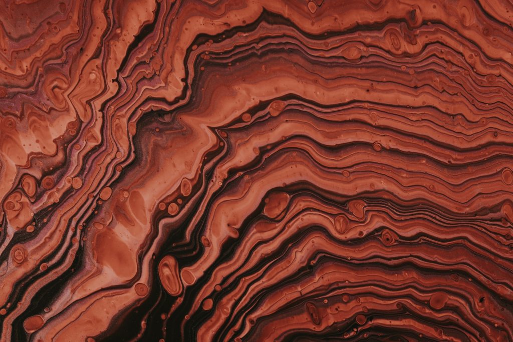
Pawel Czerwinski via Unsplash
The rise of everything retro has revived a beloved interior colour in the form of rust. Some designers argue this trend of the past few years derived from the previous blush or ‘millennial pink’ trend, adding a richer and edgier twist. Rust and other deep oranges are also perfect for autumn designs and instantly warm up a space. This colour pairs well with dark woods and other natural elements (houseplants are a great option), alluding to retro trends while keeping it modern.
Caramel
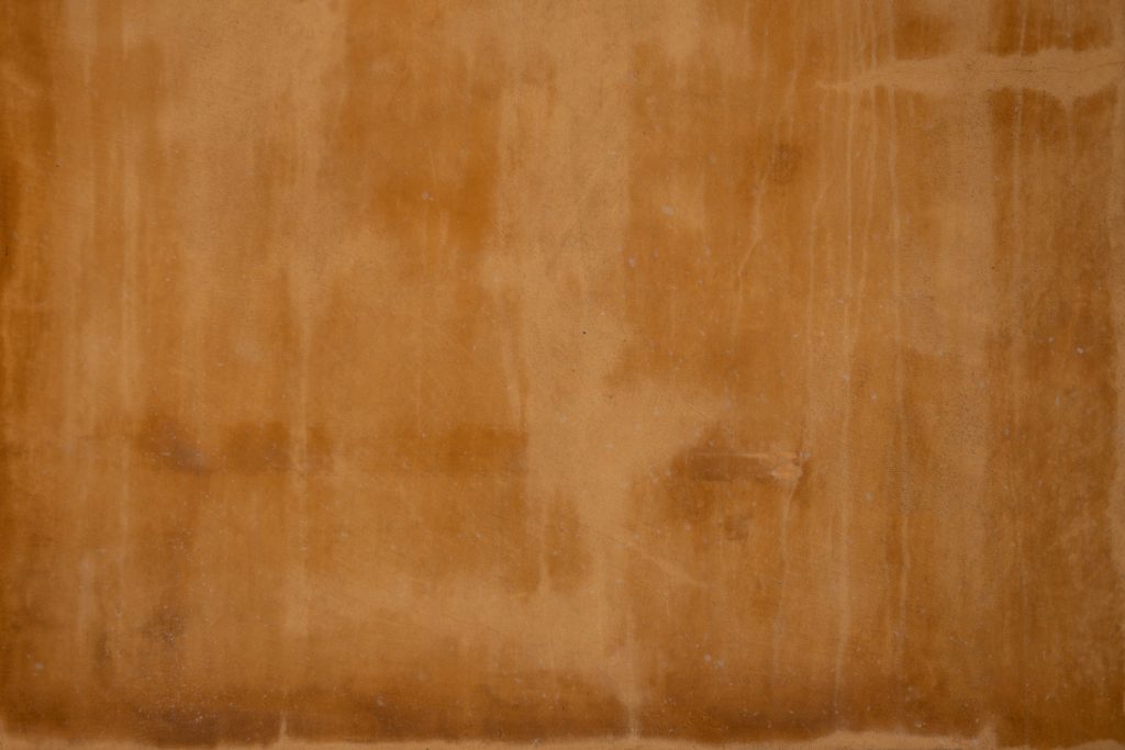
Tim Mossholder via Unsplash
If bright pops of colour are not your thing, you can always look to another emerging colour trend for that autumn feel – caramel. Stepping away from the more neutral beiges that have dominated interiors in the past few years (now comically referred to as ‘sad beige’ online), caramel has the same neutral feel with a touch of warmth. This colour pairs well with almost everything and can be used as a base or standout feature in your home.
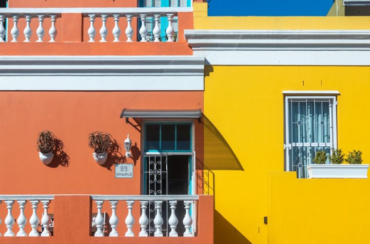
Featured image: Dorota Semla via Pexels