Creating a successful colour scheme is all about building colour relationships that work well and satisfy the eye. Whatever mood you’re after, we show you how to choose shades that harmonise, contrast or complement each other
Seductive romance: complementary colour scheme
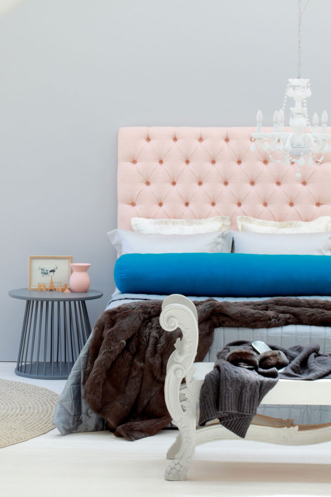
Paint colours: wall, Luxurious Silk, and handcrafted bench, Pearlglo, both colour Grey Steel 2; white spray paint on chandelier; side table, colour Night Jewels 3; vase on side table, colour Autumn Fern 4, all Dulux.

To create a quietly luxurious look in this bedroom, we decided on a complementary scheme and chose two contrasting colours that are opposite each other on the colour wheel: a strong blue, Atlantic Surf 1, and a peachy orange, Autumn Fern 4 (both from Dulux). We used these paint swatches to guide our choice of fabrics and accessories.
To create a suitably serene backdrop we painted the walls in a contemporary neutral, Grey Steel 2, which was selected from the Dulux ‘Calm’ colour mood. According to Dulux Colour expert Sonica Bucksteg, the various paint colours in the ‘Calm’ mood are ideal for creating soft, understated and sophisticated interiors. “The high level of grey creates muted chalky colours that are ideal for north-facing rooms,” she adds.
To achieve a sense of tranquility, we kept the key colours separate and focused on adding details like the buttoning on the headboard and the intricate lines of the crocheted carpet. To pile on a sense of luxury and romance, we dressed the bed with a cashmere throw and French bedlinen.
Bright and breezy: analogous colour scheme
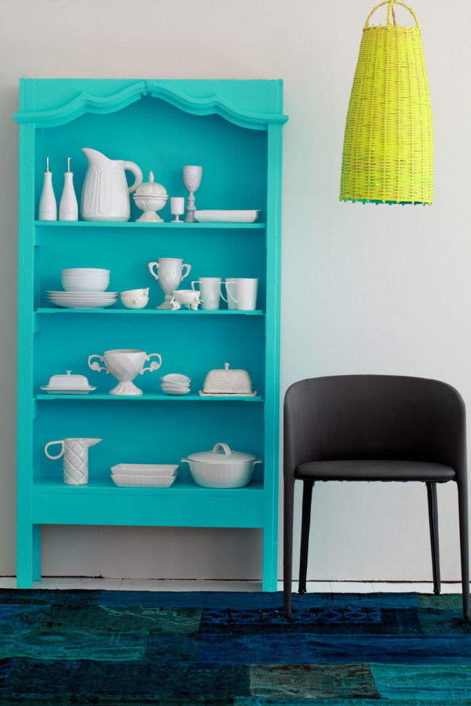
Paint colours: wall, Luxurious Silk, colour Dusted Moss 2; shelf, Pearlglo, colour Crystal Surprise 2; light fitting inside, colour Grecian Spa 1; light fitting outside, colour Lime Zest 2, all Dulux.

An analogous colour scheme combines colours that are next to each other on the colour wheel. We mixed cheerful blues and greens from the Dulux ‘Fresh’ colour mood; these colours are pure, clean and crisp, and include a wide range of shades from brights to the palest pastels. “If you want to maximise light in a room and make dark rooms appear lighter, use these pale pastels,” says Sonica.
We combined all the blues and greens in the carpet, but kept the rest of the room simple with the turquoise shelving providing a vivid backdrop to a collection of beautifully-shaped white ceramics. To add a quirky touch, the light fitting has two colours – one inside and one outside – and the black chair anchors the scheme.
Boldly saturated: triadic colour scheme
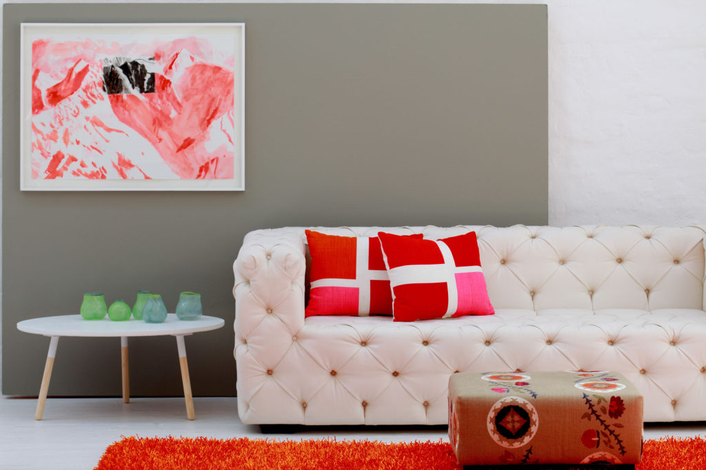
Paint colours: wall, Luxurious Silk, colour Dusted Moss 1; table, Pearlglo, all Dulux.
.jpg)
A triadic scheme combines three colours that are evenly spaced around the wheel; we used this scheme in this modern living room, mixing strong, powerful colours for a dramatic effect. We chose orange and green and added a hint of purple, which we picked up in the fabric on the ottoman. The colours we chose all come from the Dulux ‘Rich’ colour mood. “These colours include dark shades to mid-tone colours,” says Sonica, “and are dynamic colours which are great as accent colours or for adding drama and impact.”
The walls in Dulux’s Dusted Moss provide a neutral background to the contrasting strong oranges and pinks used in the cushions, carpet and artwork, and the glassware in green provides an accent. Use a neutral colour (in this case grey) on the walls, and keep the floor, sofa and side table white, then add accessories (which are easy to change when the mood takes you) in fun colours you love.