Colours have an interesting way to add new life into your space. Deciding on the colour palette for a room can be high-stakes and fairly tricky. Before you begin choosing paint colours, furniture, or decor, it’s important to understand which colours work best together and why.
Which colours work well together and how can you use them to breathe new life into your home?
Pairing yellow and purple or blue and orange may seem loud and awkward but these combinations really do work! Colour theory can really help you crack the code of playful colour pairing – and you won’t believe just hows simple (or stunning) pairings can be.
Michelle de Villiers and Christi Milosevich, the creative duo behind Botanika Design and Style, a Johannesburg-based interior design firm that produces imaginative, eclectic spaces, shared some of their secrets with us. Their insights will give you all you need to know about introducing new colours to your space.
Opposites attract
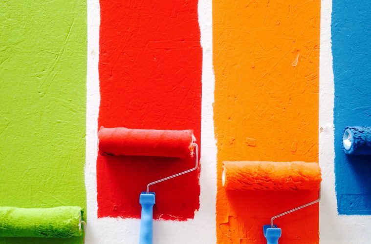
In a nutshell, complementary colours are opposite hues on the colour wheel. When placed side by side, these opposite colours produce the strongest possible contrast. This bold contrast produces striking design that is equal parts theoretical and fun, maximising the potential of both of the colours.
“If you are considering using complementary colours in your room, don’t pick obvious primary shades,” notes Michelle. Instead, “Print out a colour wheel or get a colour chart from the paint section at your local hardware store and let that guide you.” There is no need to be confined by the most obvious pairings.
Where to start
So, you understand the theory but how do you go about implementing it in a tasteful, personalised way? Christi suggests selecting your contrasting pair, and then deciding which of the two colours you favour most. “Use the dominant, preferred shade as the feature wall and the second choice as accent colours. Bring accent colours through your scatter cushions, accessories or even artworks.”
Like all other design concepts, it’s personal. The theory is one thing, but applying it in a way that makes you feel comfortable and expressive is another. Always go with your gut when picking the dominant colour, then let your decor do the talking with your secondary shade.
Read more: Choosing paint colours to open up small spaces
Light-hearted picks
“Where many people go wrong with their colour picking is lighting,” says Michelle. Christi adds that ‘lighting is often overlooked, but it’s key to the success of the pairing. Lighting plays a huge role in how colours are perceived.”
A warm sunflower yellow will look far different in a small, dark bathroom compared to a light, airy open-plan lounge, right? Right!
When shopping for your new colour scheme, it’s best to do your homework. Use complementary paint swatches to see what colours will look like in your specific space. Seeing the colours in their new natural habitat will help you make decisions around the dominant colour – a colour that works best for you specifically.
Do your due diligence by observing the swatches in daylight, sunset, and under your room’s artificial light. Remember that colour is dynamic, so your perception of it will shift as the light does.
What to avoid
Knowing what is incorrect is just as valuable as knowing what is correct. These are Christi and Michelle’s key things to avoid when applying complementary colours.
- Commit to opposites instead of shying away from the stark contract and dulling the effect.
- Ensure that the combination you choose truly lies as opposites on the colour wheel for maximum effect.
- Be selective.
- Because you will be introducing such an attention-grabbing contrast, be sure to pare down the use of additional colours.
- Adding too many colours to a space can be overstimulating and detract from your focal point.
- Stick to two colours and let nudes, blacks and whites do the most.
- Follow your intuition by choosing colours that speak to you. If the thought of pairing colours like red and green sends shivers down your spine, it’s not the pair for you. However, if you’re open to the idea, go for a bright floral that expertly pairs the two opposites in an organic, natural way.
ALSO SEE:
Colour guide: a fresh coat of paint can totally transform your home
A version of this article was originally published in the Garden&Home July 2022 printed magazine
Feature image: Pexels