Urban Glow, Natural Balance, Vivid Expression and Tailor Made are the four themes that emerged from Plascon South Africa’s 2015 colour forecast and they all fall under the broad theme of “Celebrating Colour”
Anne Roselt, Colour Marketing Manager at Plascon Paint, tells us more about the latest trends, colour do’s and don’ts and how to successfully incorporate colour into your home.
Which colours feature strongly in the different themes?
Theme 1: Urban Glow
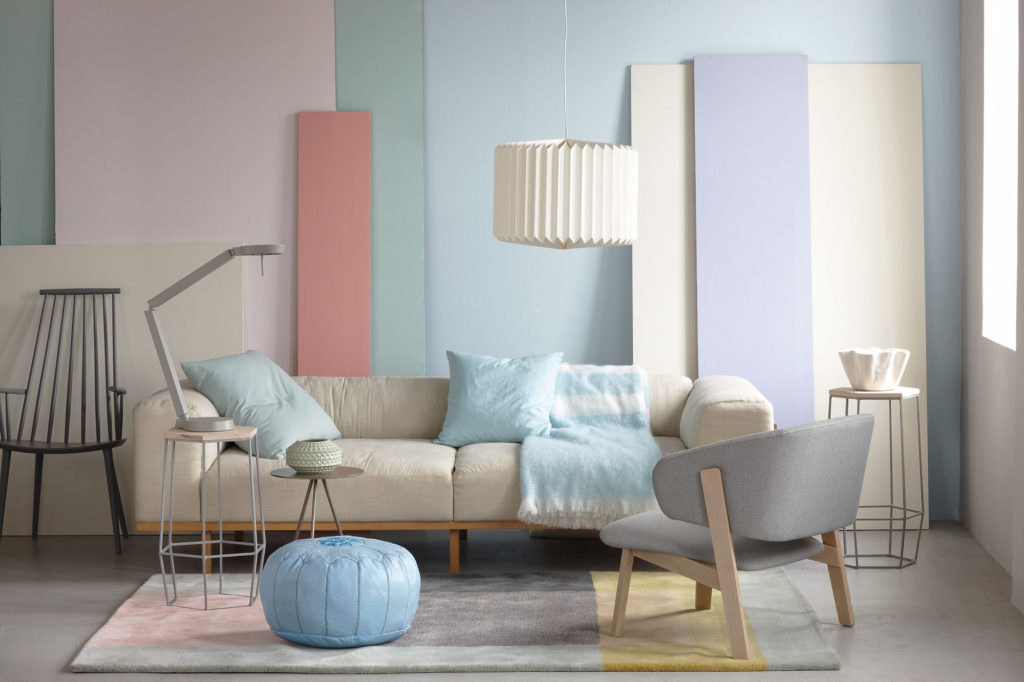
Urban Glow is a range of pastel colours inspired by the sky at dawn over a city scape. Key colours here are pinks and greys. Another key colour is a sea-foam green called Sparkling Water .
Theme 2: Natural Balance

The second theme, Natural Balance, is inspired by nature and luxurious dark greens feature strongly.
Theme 3: Vivid Expression
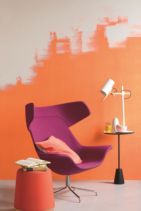
Vivid Expression is a range of bright colours that can be used together or separately. A spring green and sapphire blue stand out in this theme.
Theme 4: Tailor Made
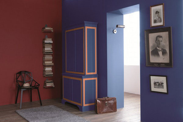
Tailor Made is driven by warm, comforting neutrals as well as dark colours. A very dark blue and black create intimate spaces.
What colours do you use, or will you use in your own home in 2015?
I really love the sea-foam green colour and definitely plan on using it in my home in 2015.
What is the most common mistake people make when choosing colours for their home?
We all lead such busy lives that we go for the safest option, which is normally off white or cream. While there is nothing wrong with this, if you take the time to think about introducing colour into your home the results can be so rewarding.
Is there any colour or trend you’d like to see make a comeback?
Paint effects are making a comeback. Not the old ragging and sponging effect but fresh, new paint effects. Multicolour washes, colour blends and watercolour effects, to name only a few, are coming through.
How do you know when a colour combination works?
You know it works when it looks good. If you are unsure of a colour combination do an internet search, Pinterest is a good place to start.
There is a systematic shift away from neutrals to more daring colours? Why is this?
We all have our own personalities, tastes and preferences. The colours we choose reflect this. My feeling is that people are ready to show who they are rather than try and be like everyone else.
In terms of paint finishes, what are the biggest trends?
Geometric shapes is one we are seeing a lot of.
If there is one piece of advice you could give home owners when choosing the right paint colour what would it be?
The most important advice I can give is to choose a colour that you and your family love and would like to be surrounded by. Children usually know exactly what colour they want and it’s a good idea to listen to them for their rooms rather than always playing it safe.