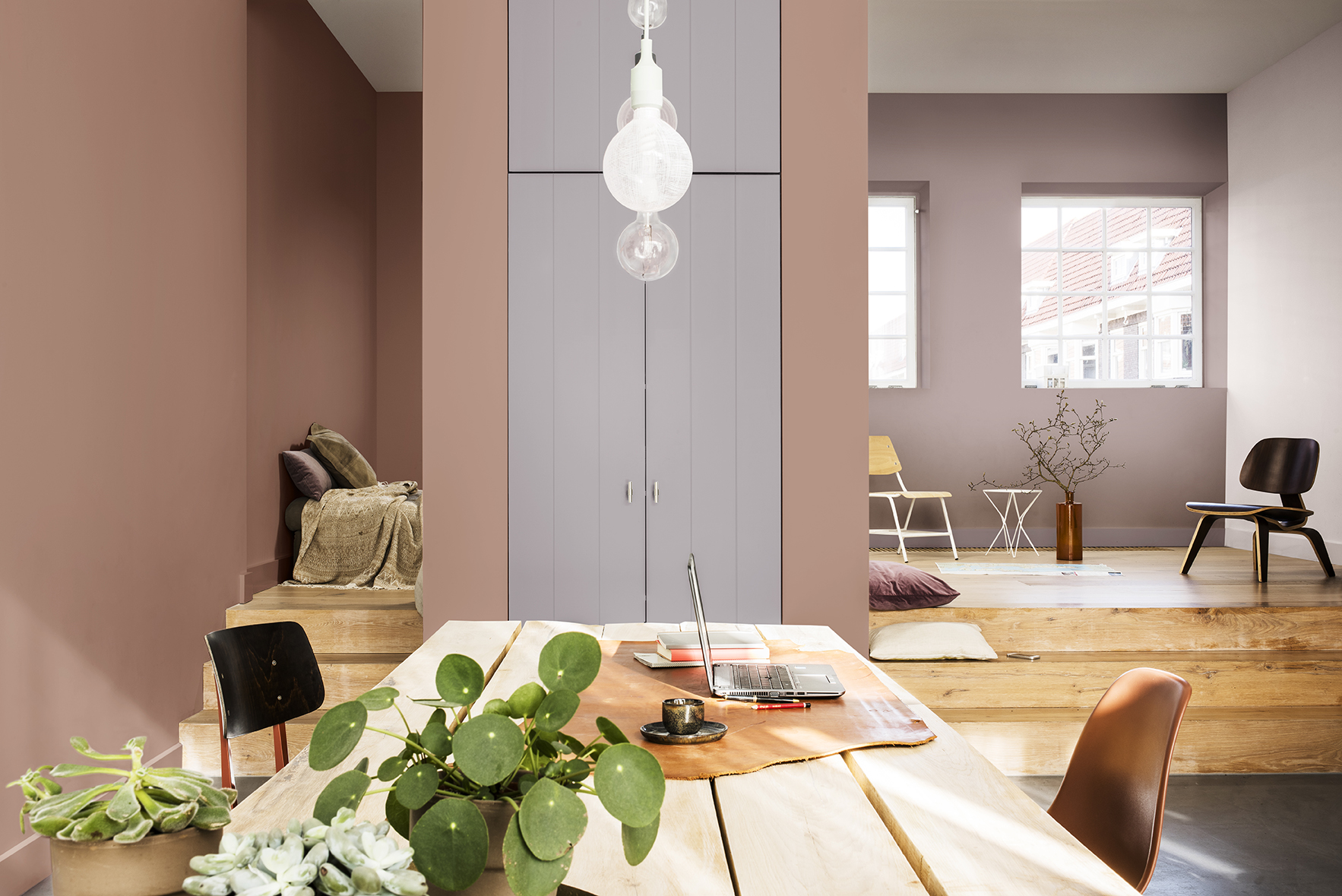
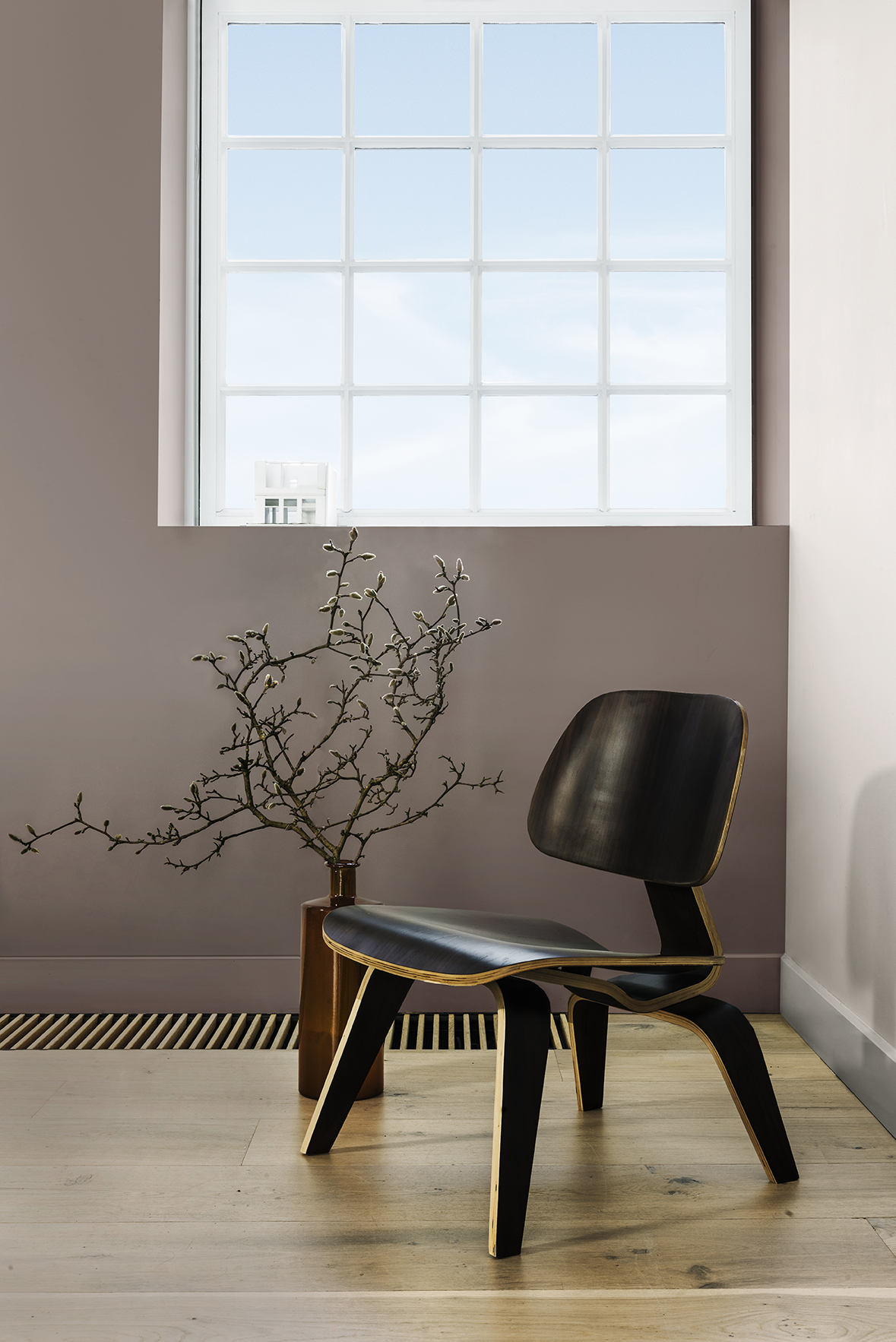
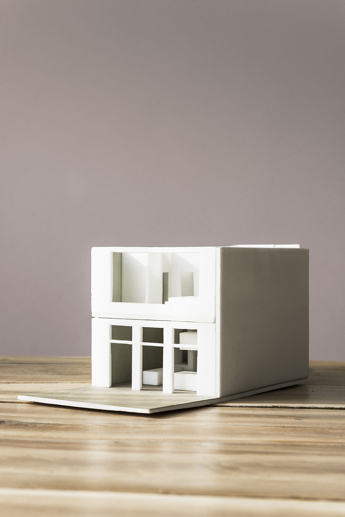
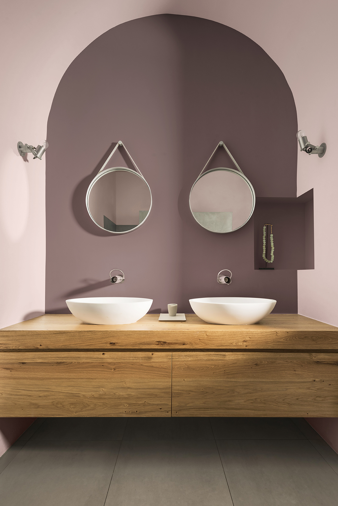
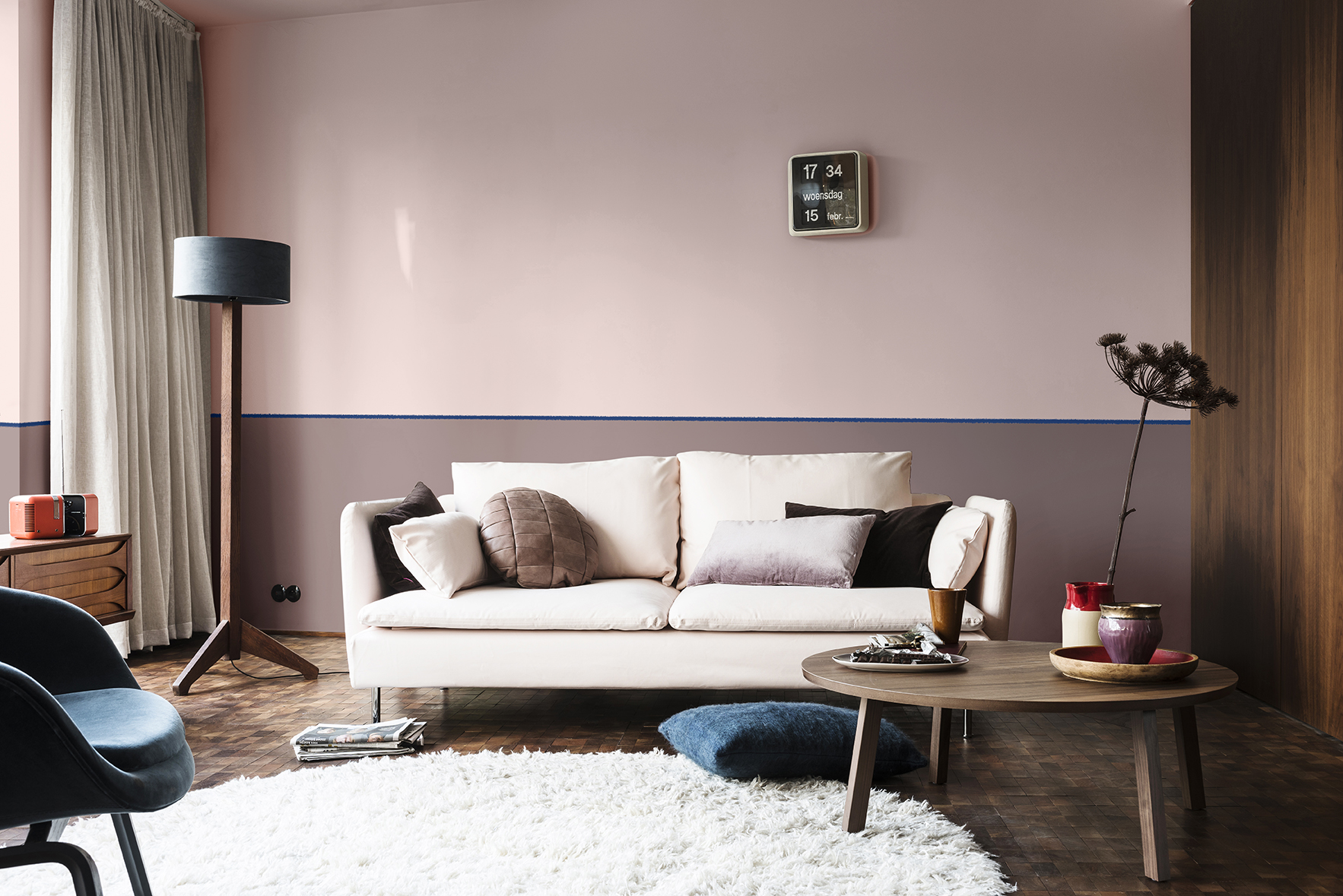
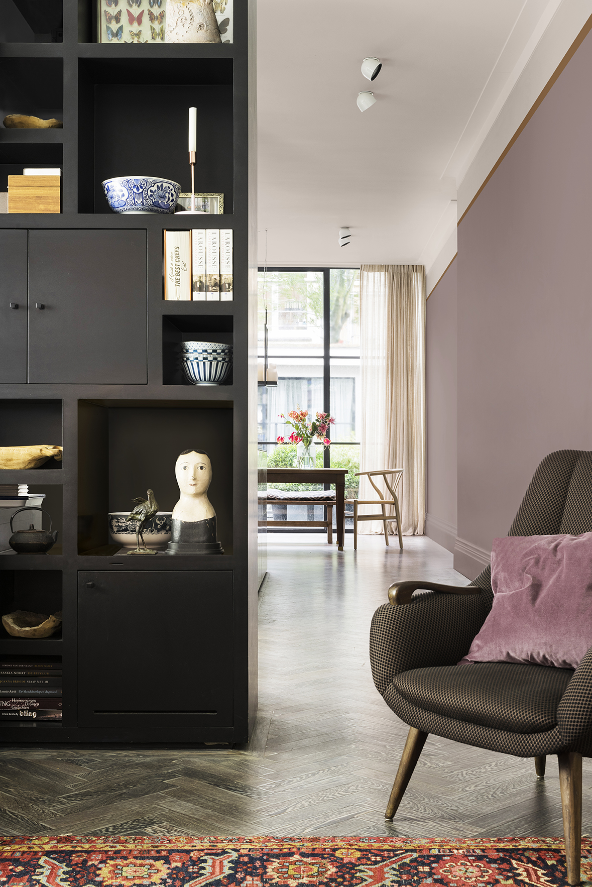
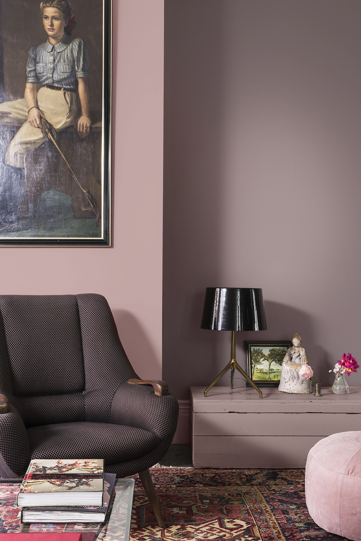
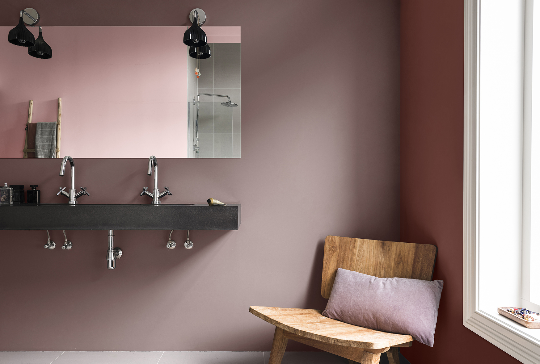
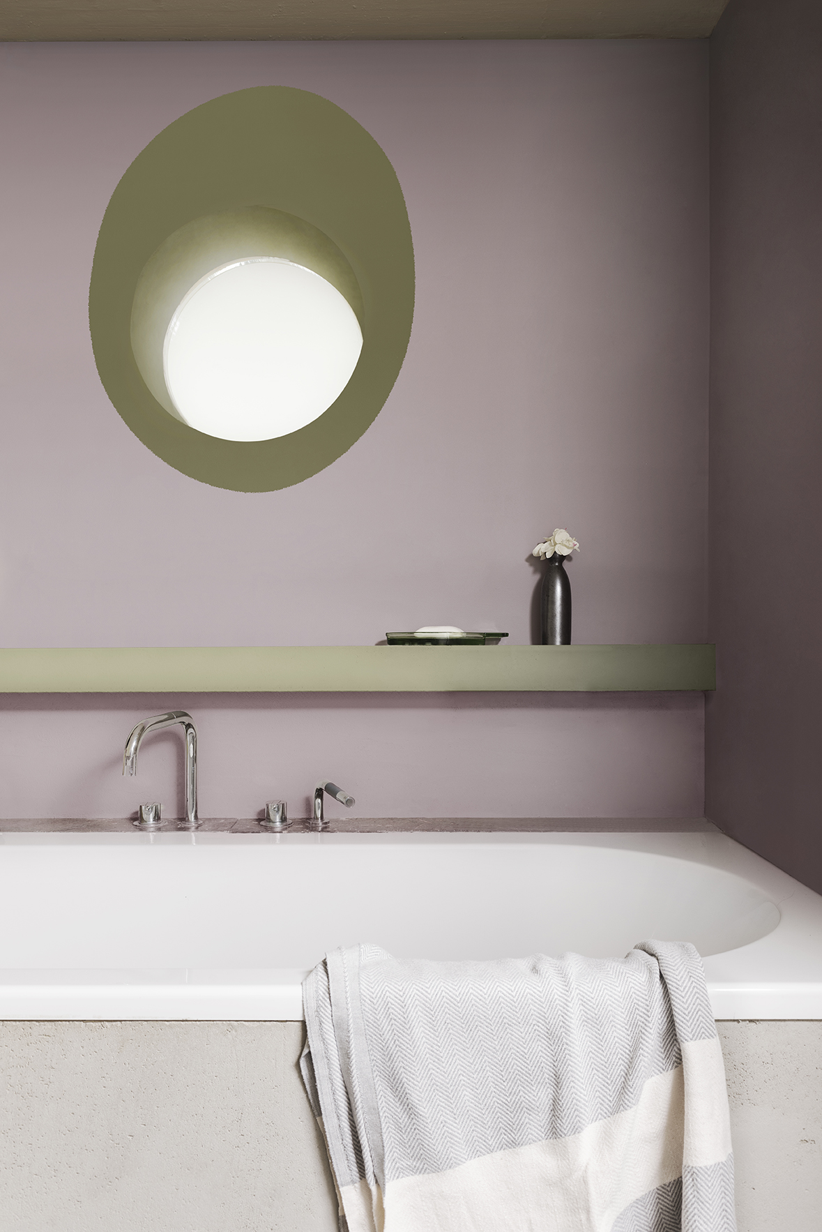
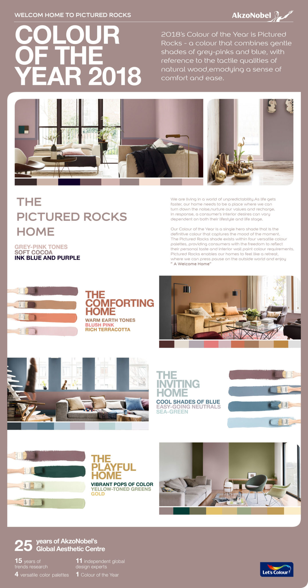
It is a subtle and warm tone of grown-up pink that draws from the tactile qualities of natural wood and leather, conveying comfort and the need to create a welcome home. It’s called Pictured Rocks also known as Nordic Sails 2; this is the Dulux Colour of the Year for 2018
The world is not the calm place it once was. We are always on the move, rushing here and there. Dulux has done extensive research into societal, economic and design trends and insights reveal that we live in a world of unpredictability, with access to more information and choices than ever. That’s why we are retreating into the comfort of our homes, where we can turn down the noise and find solace.
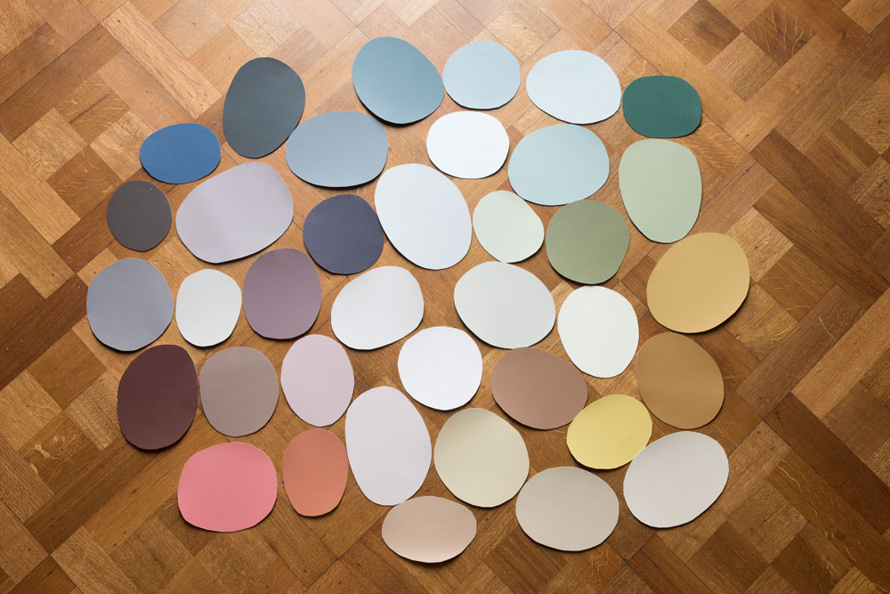
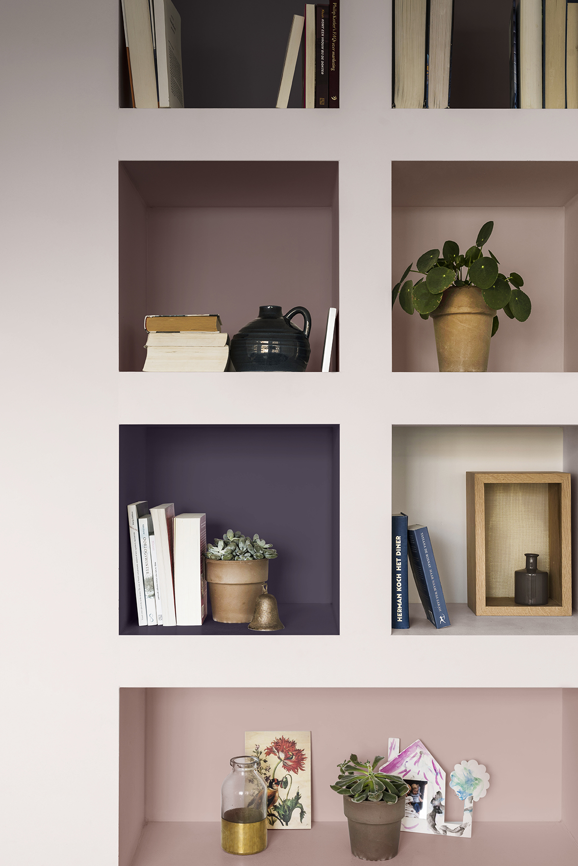
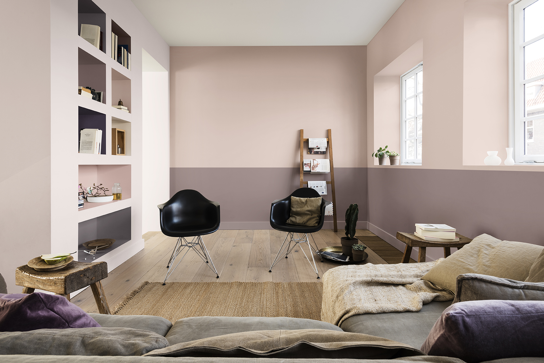
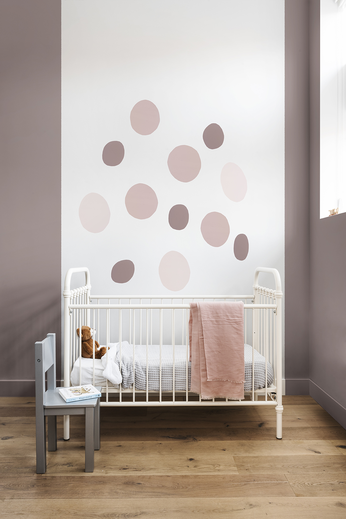
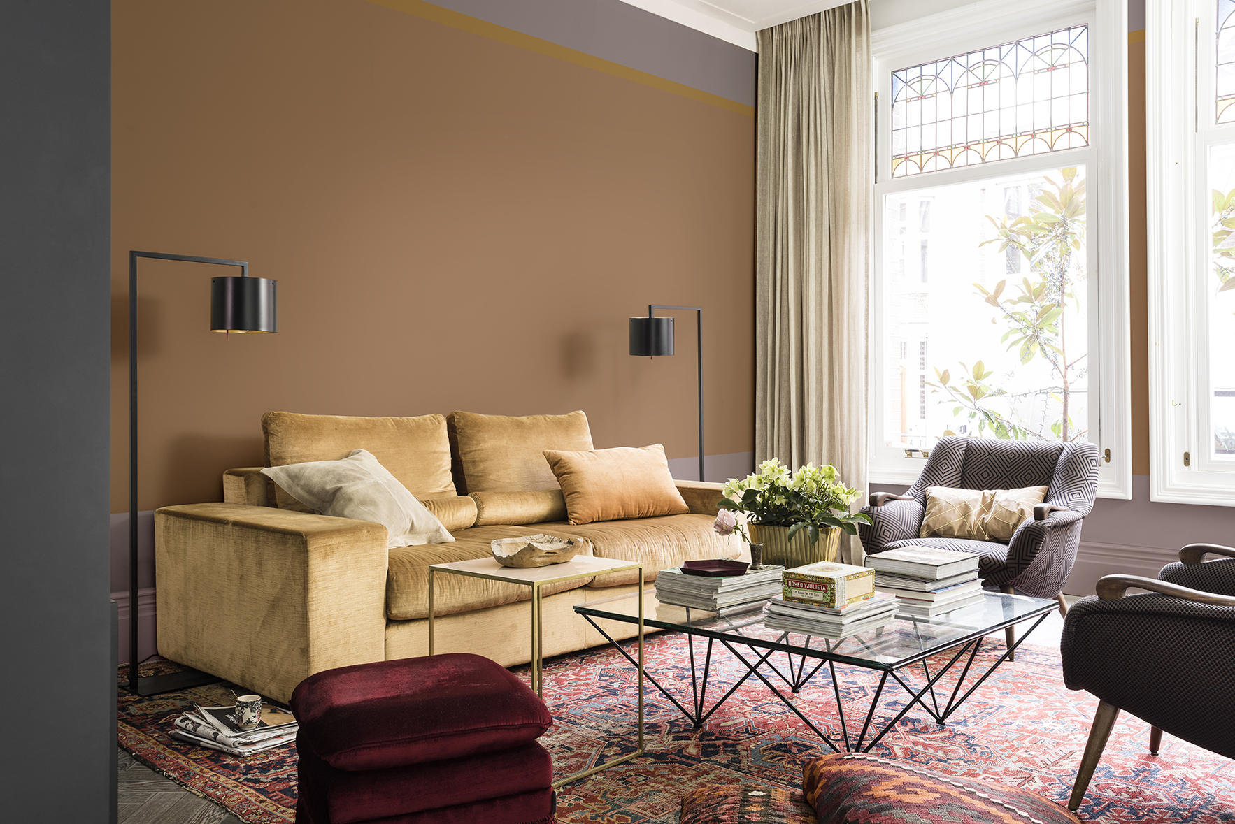
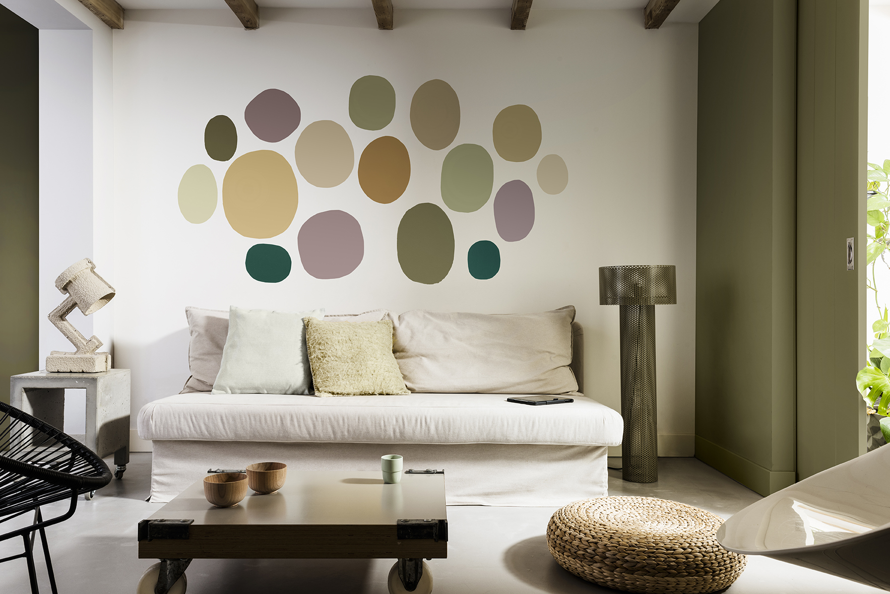
Dulux identified Pictured Rocks as the leading paint colour for 2018. The Welcome Home palette combines gentle shades of grey-pink, flowing into bolder shades of ink blue and purple. The palette blends harmoniously with the materials from which the hero colour, Pictured Rocks, takes its inspiration.

Here are three supporting palettes to complement Pictured Rocks, balancing softer shades with deeper, bolder tones. Each palette suits a different style and personality. Which one are you?
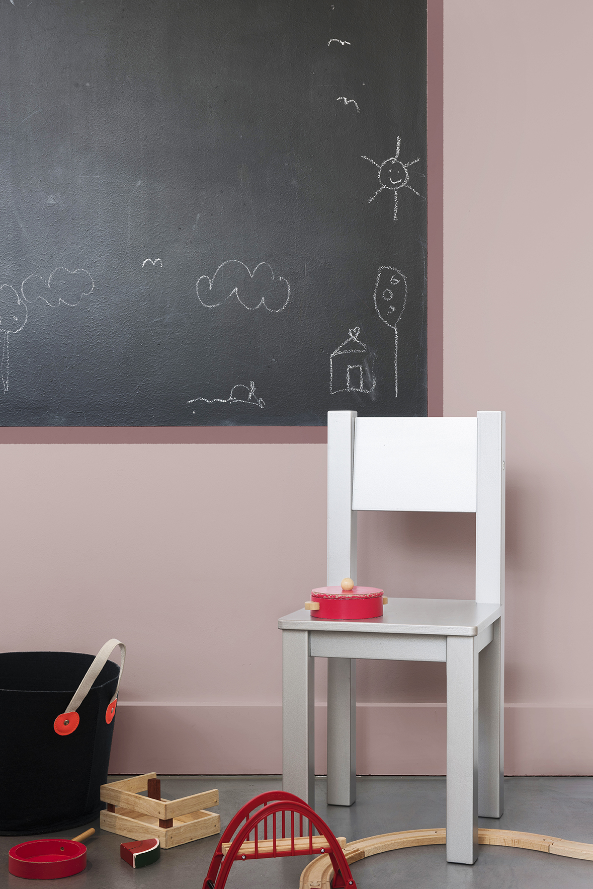
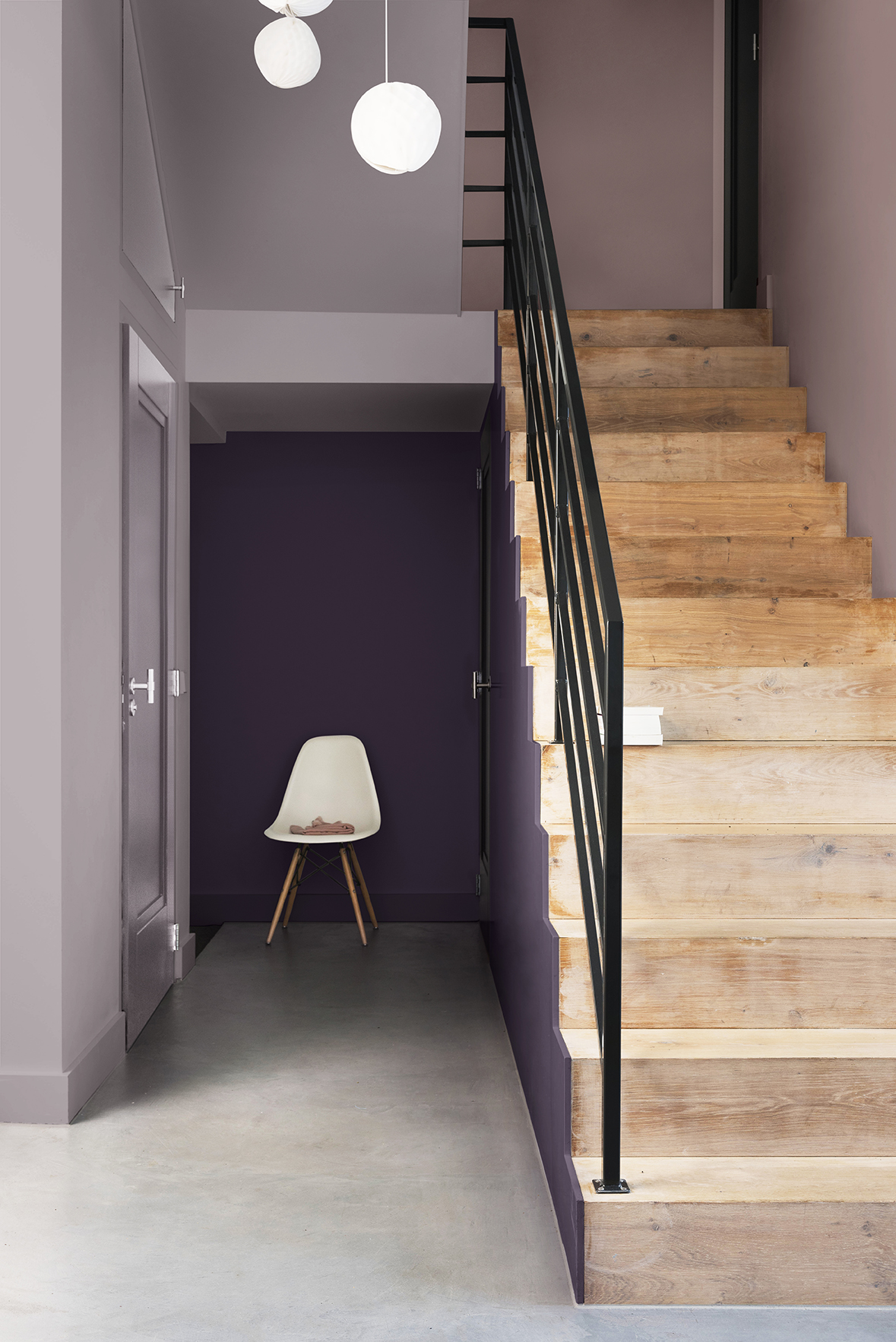
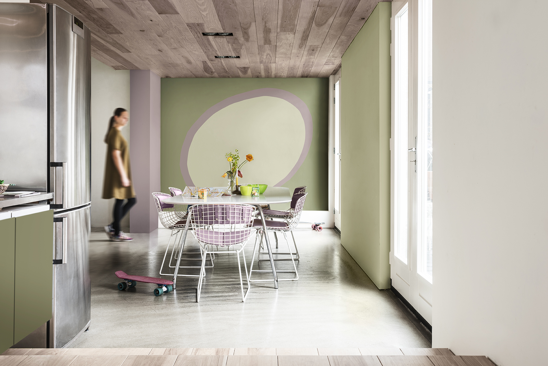
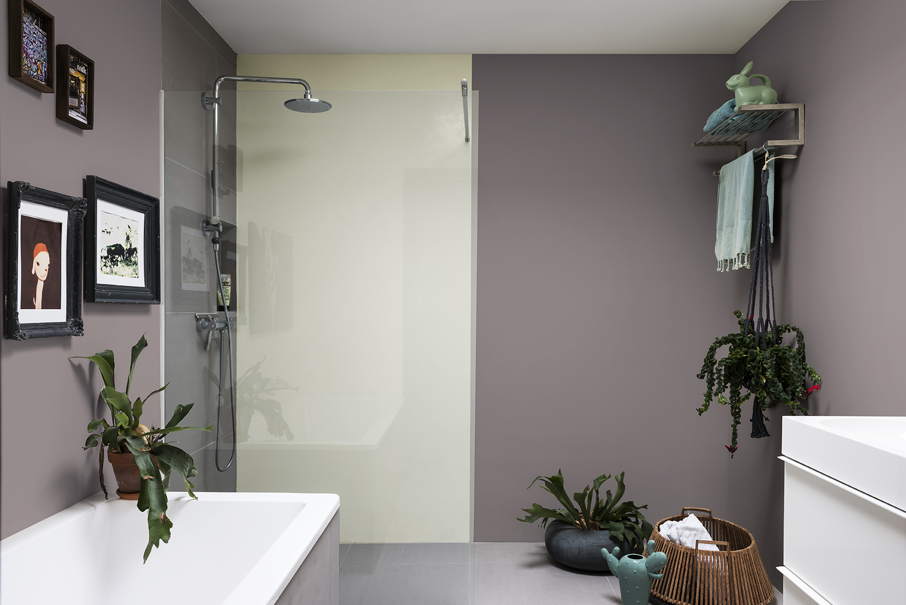
The Comforting Home
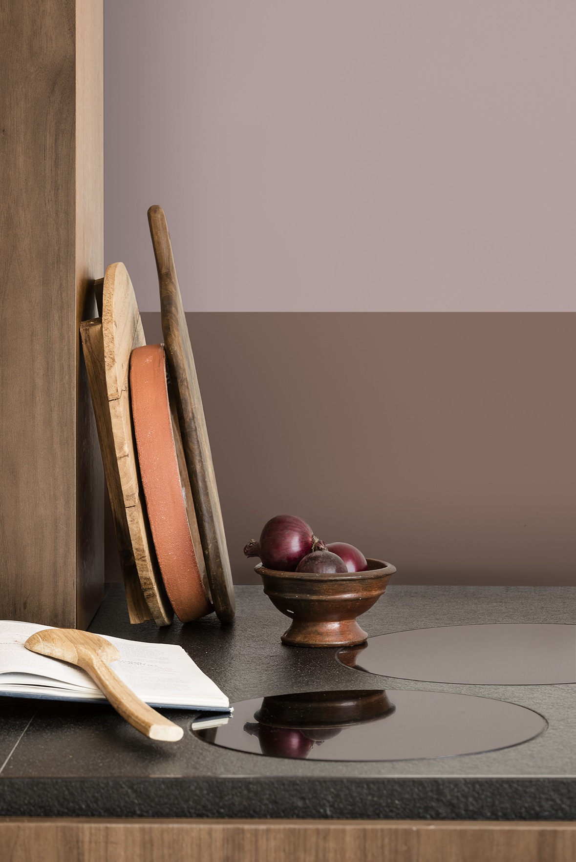
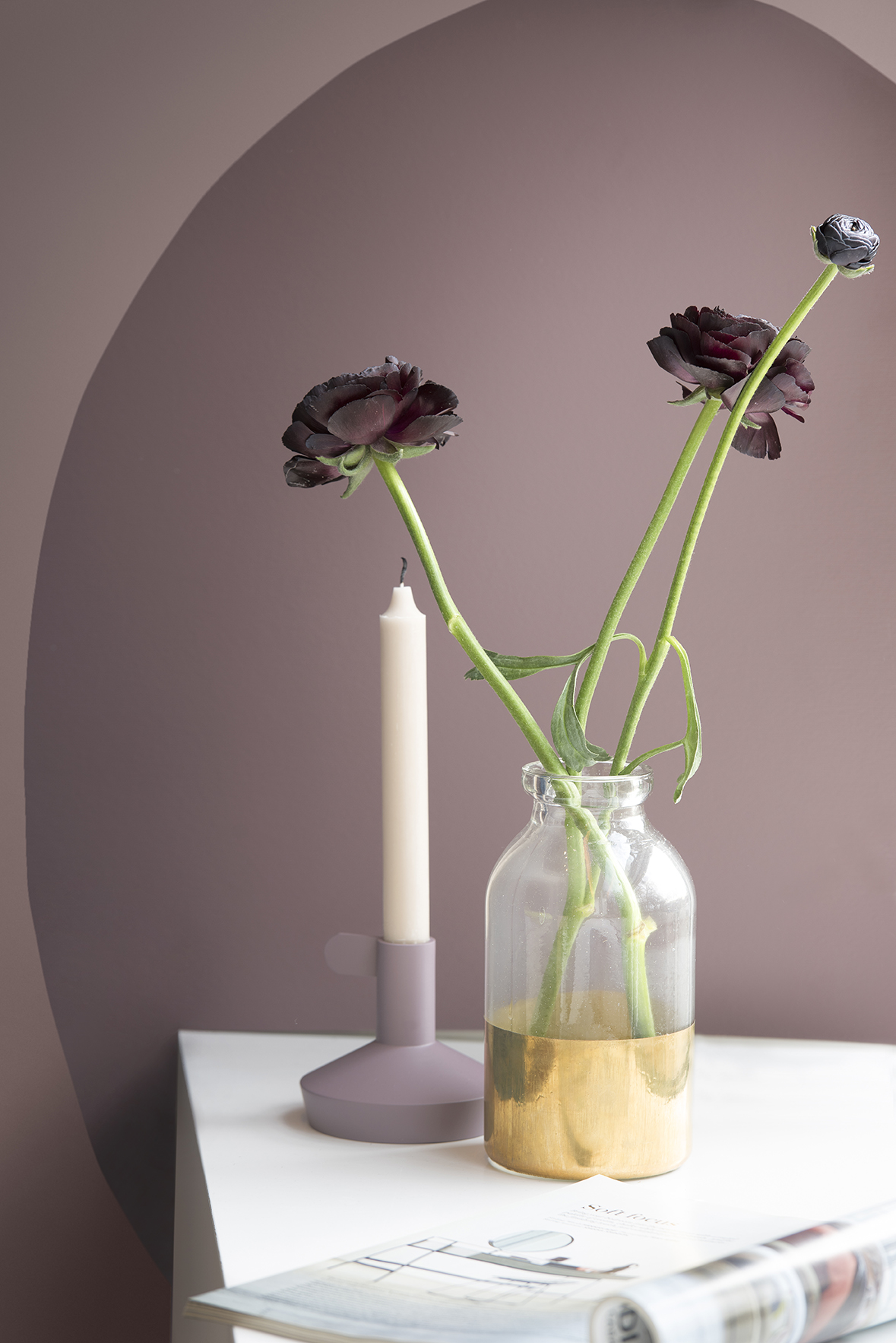
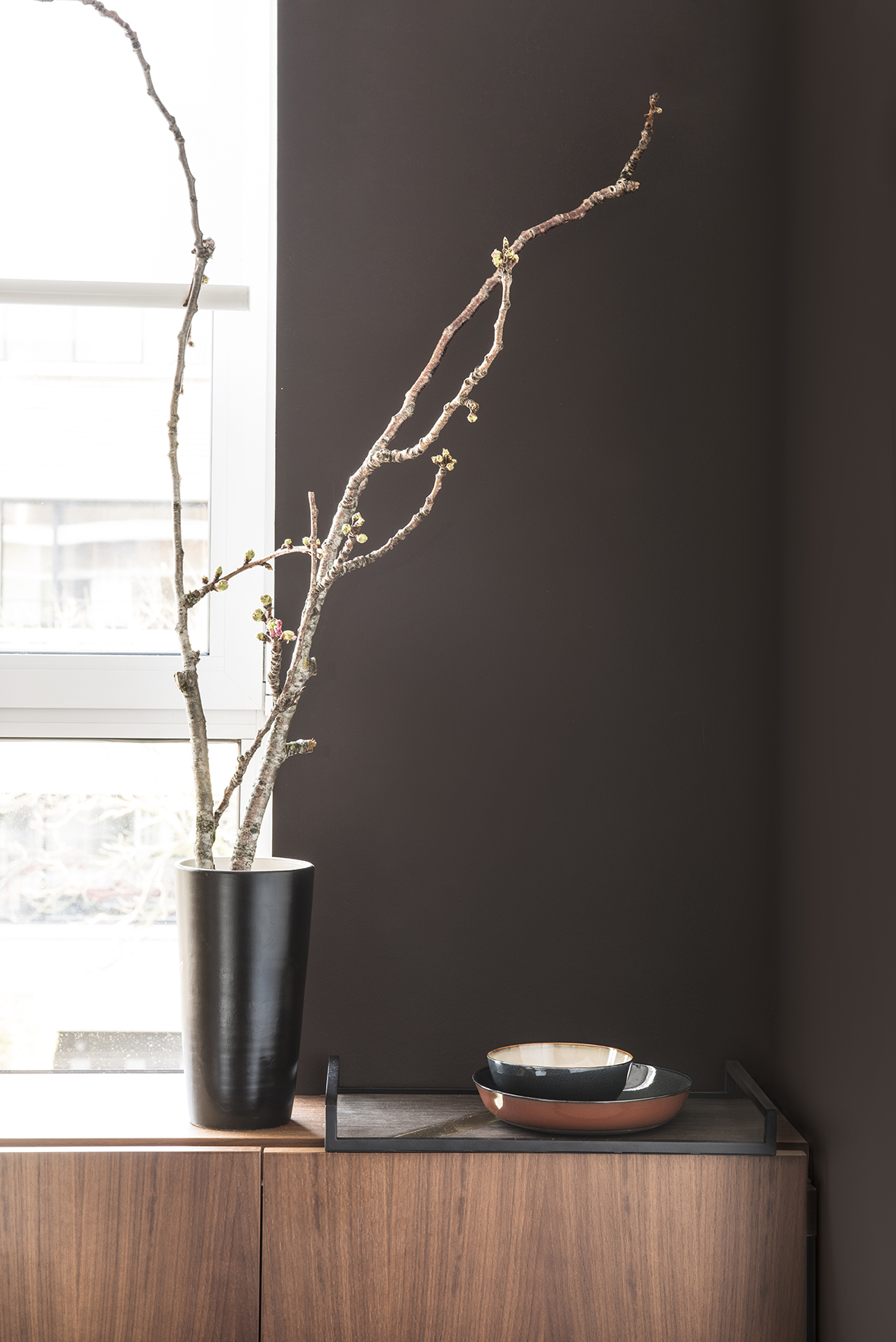
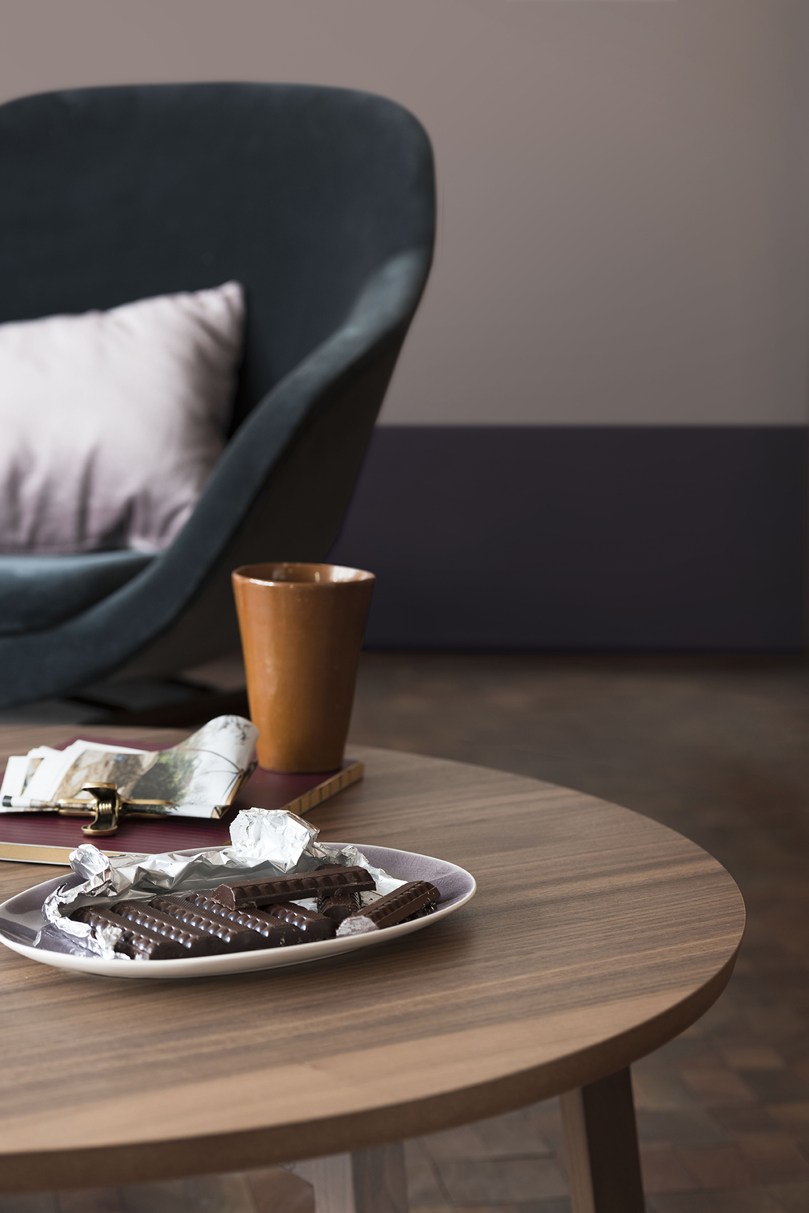
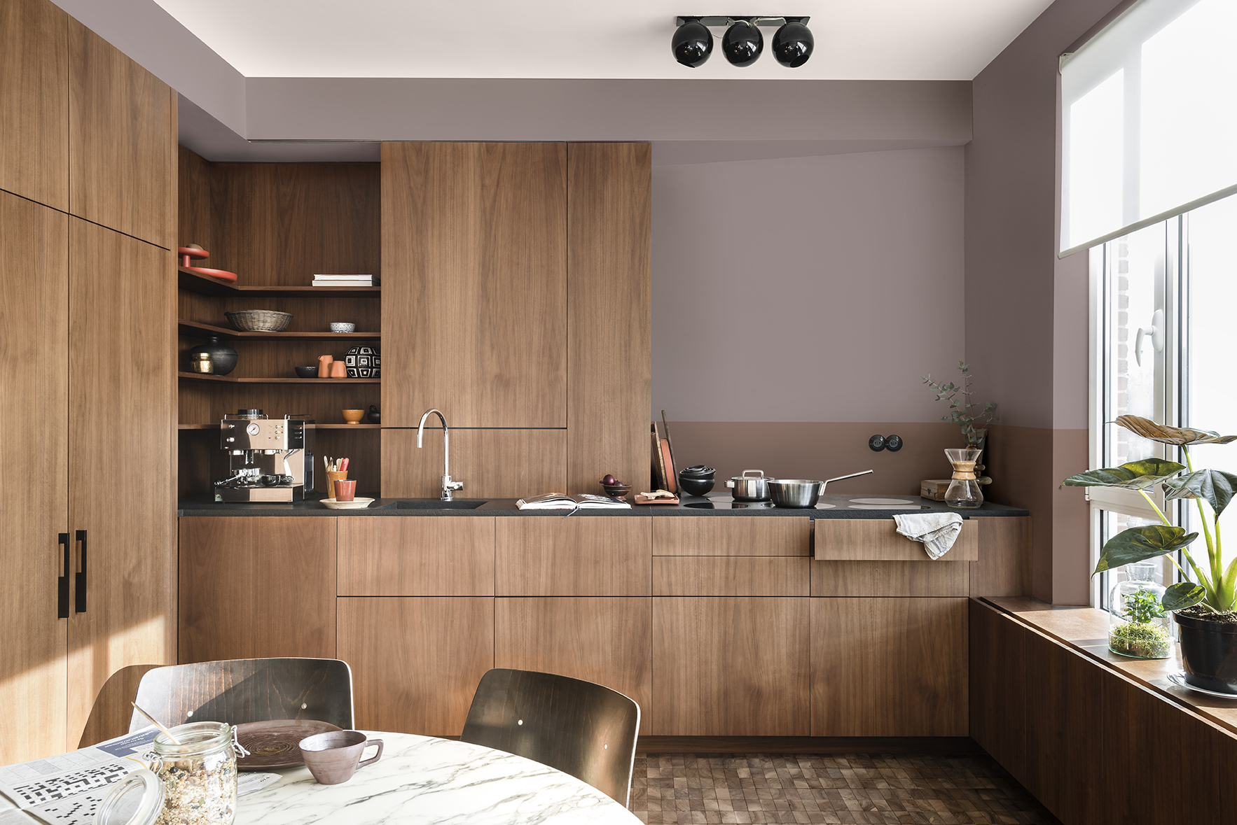
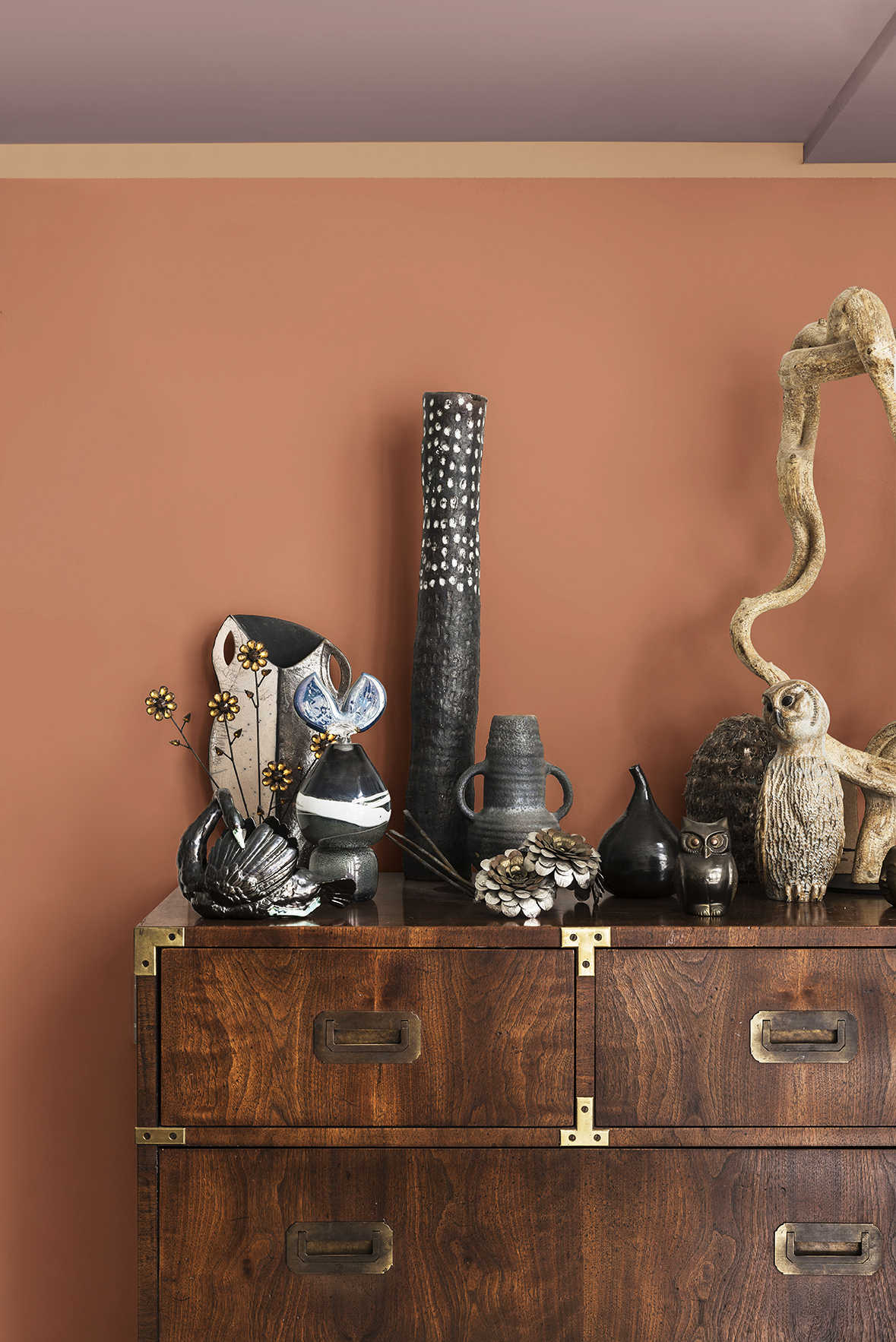
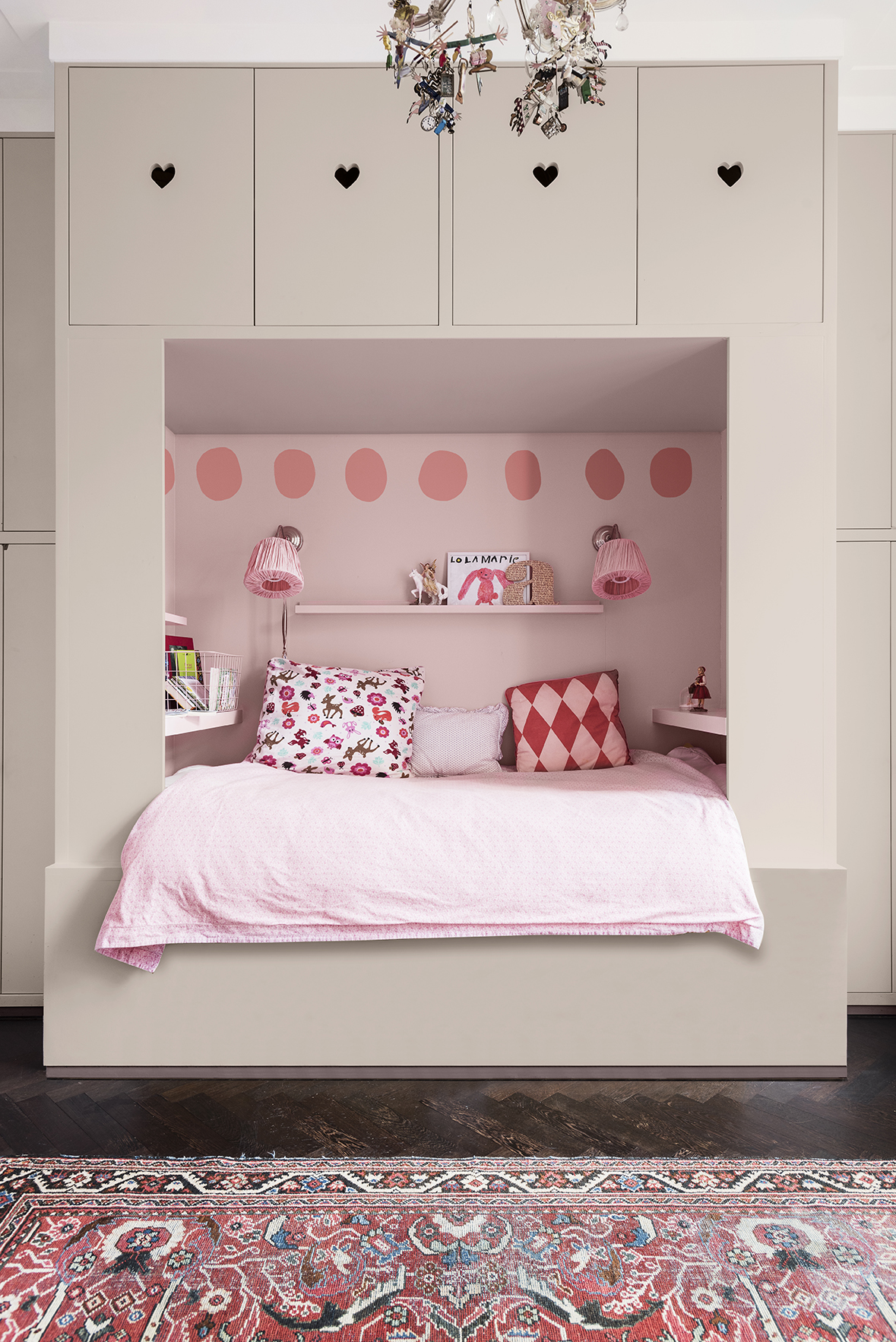
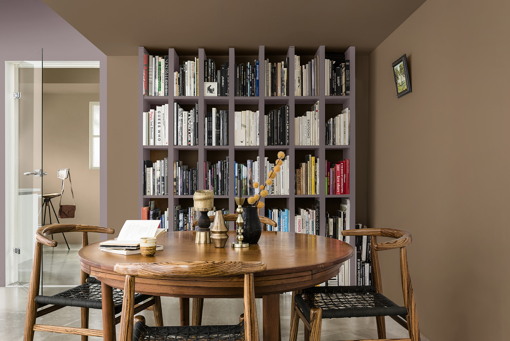
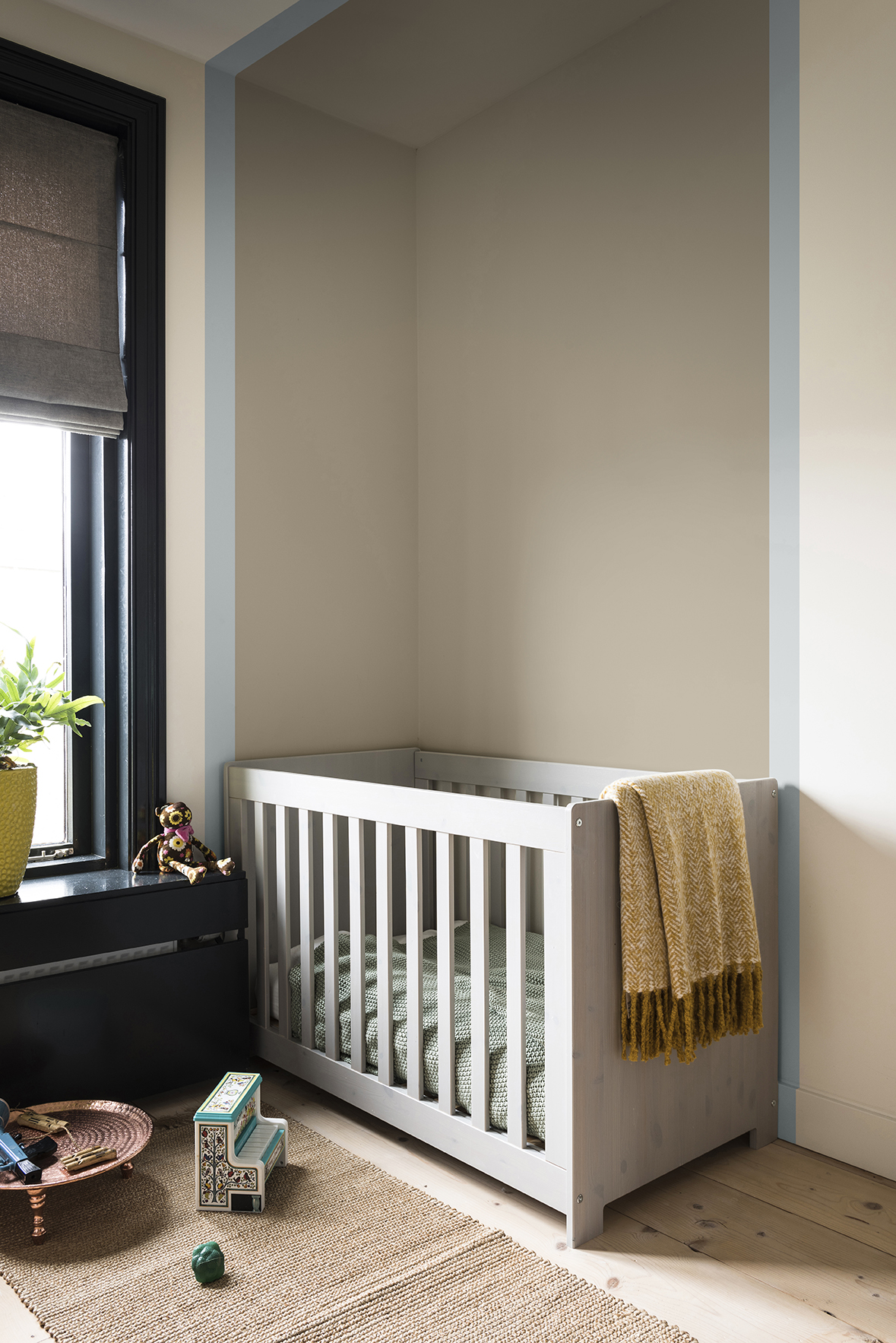
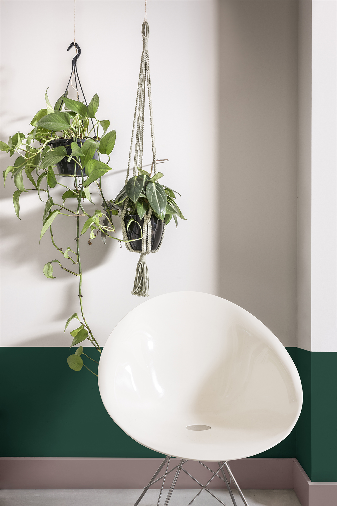
This palette creates an environment to recharge and reset the mind. A cocooning space which acts as a restorative embrace. Warm earth tones permeate this home, bringing together clay and blush pink tones to calm the mind, soothe the senses and shut out the noise. Rich, welcoming textures such as silk and velvet create a space that you want to touch and sink into.
Personality of the palette:
- A space in which to retreat
- Warm-hearted persona seeking to reconnect with themselves
- Minimal technology, bringing nature into the home in a controlled way
- Beautifully balanced aesthetics with function in interior design choices
- Comforting hardwoods and tactile textures are staples for them


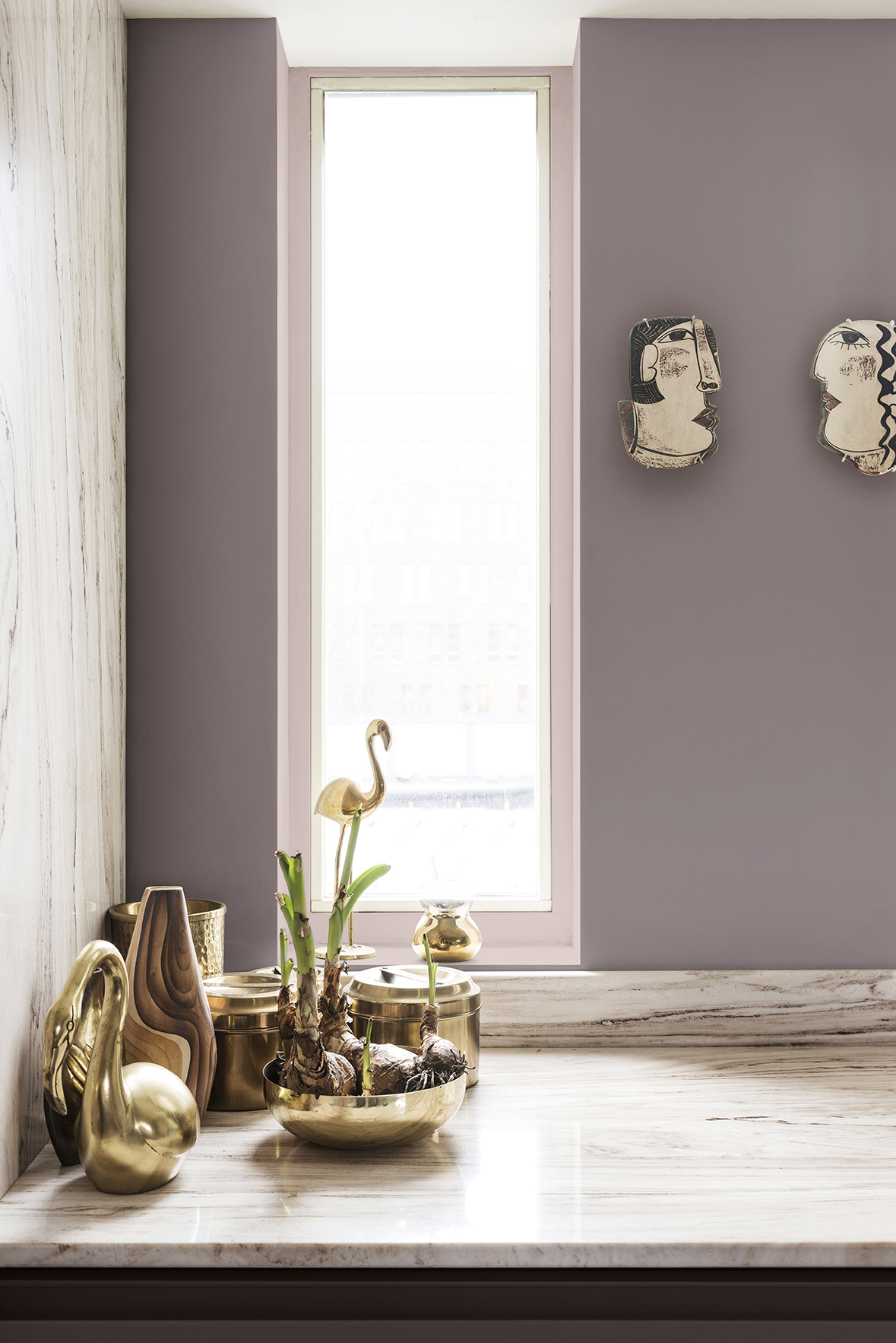
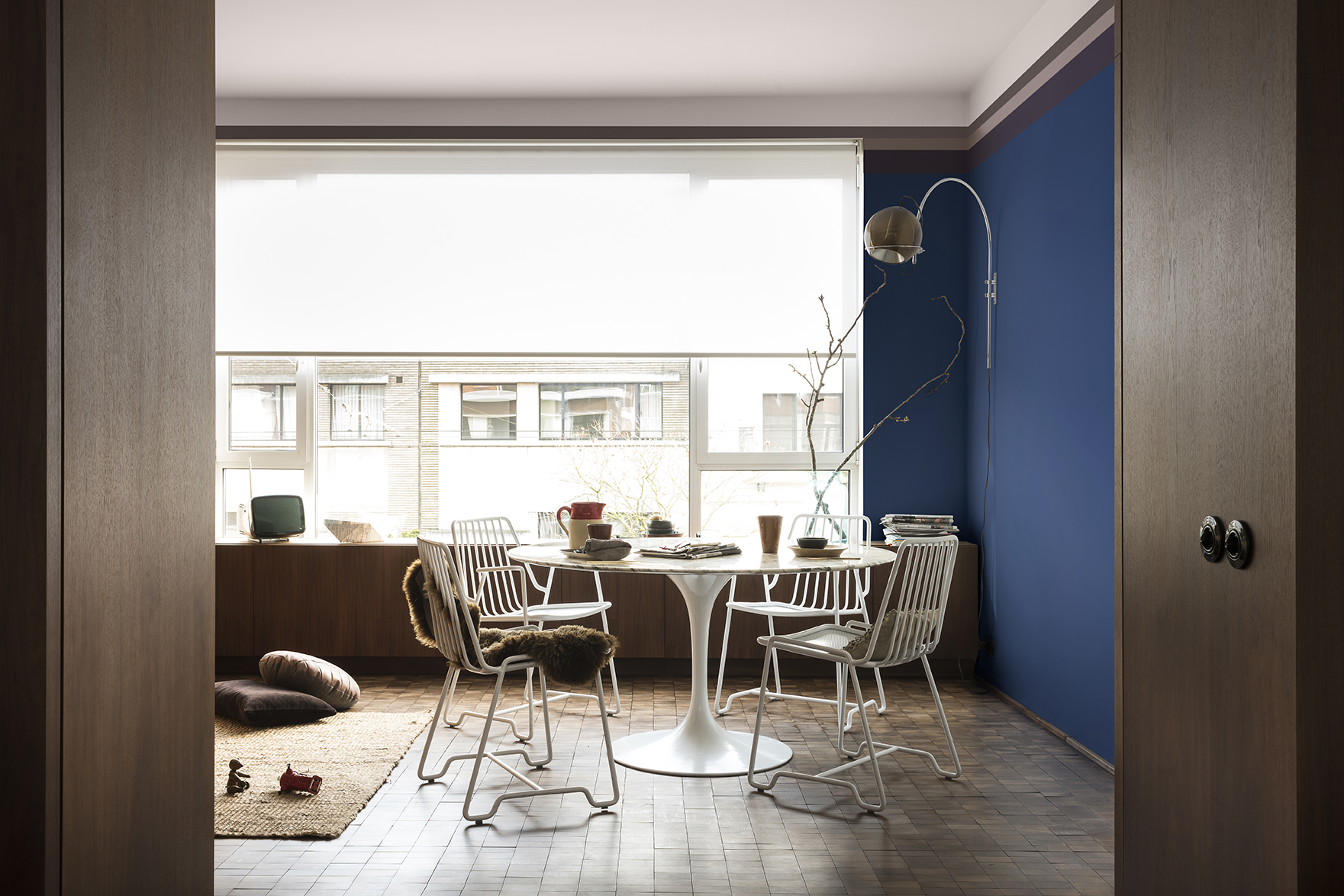
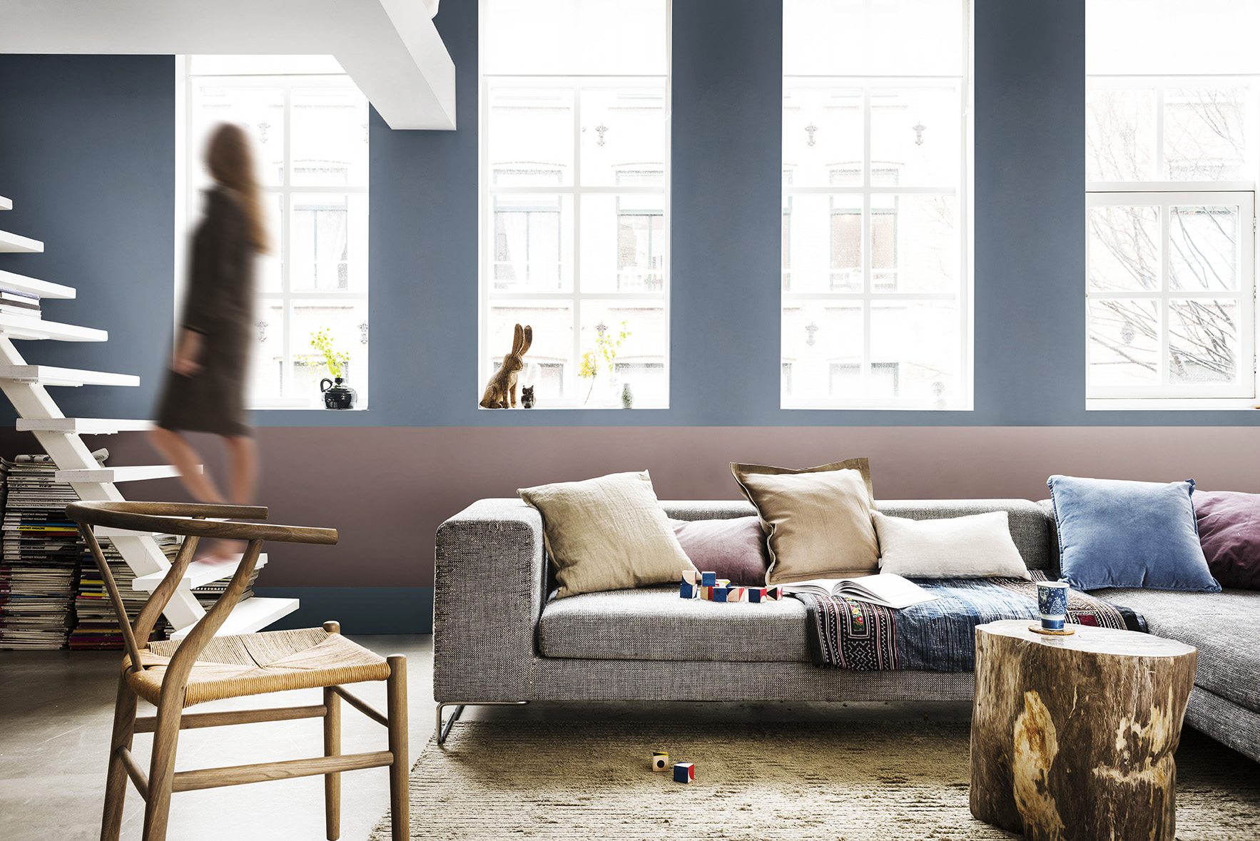
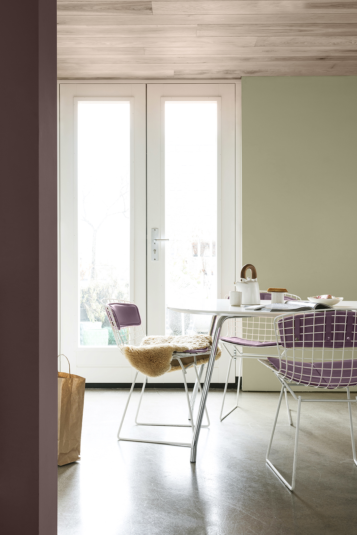
The Inviting Home
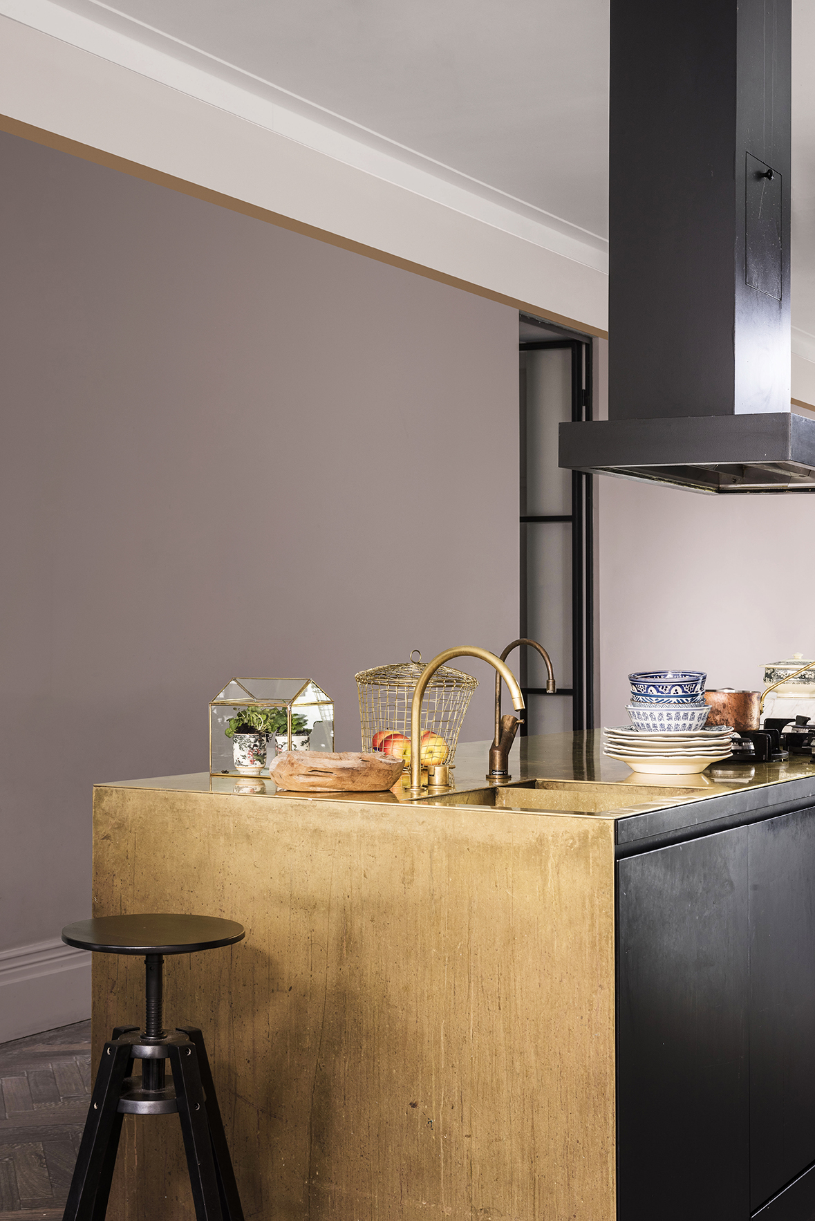
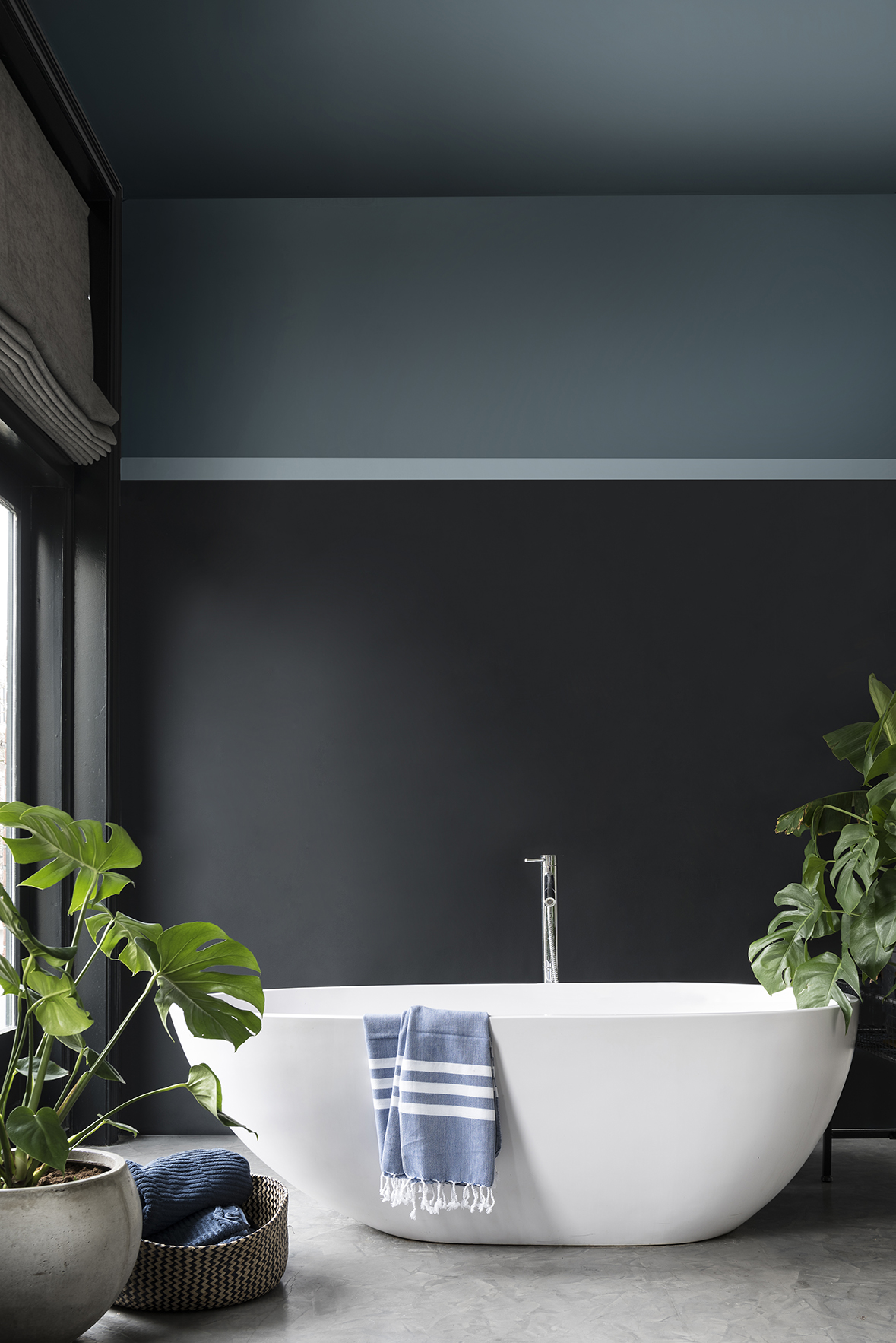
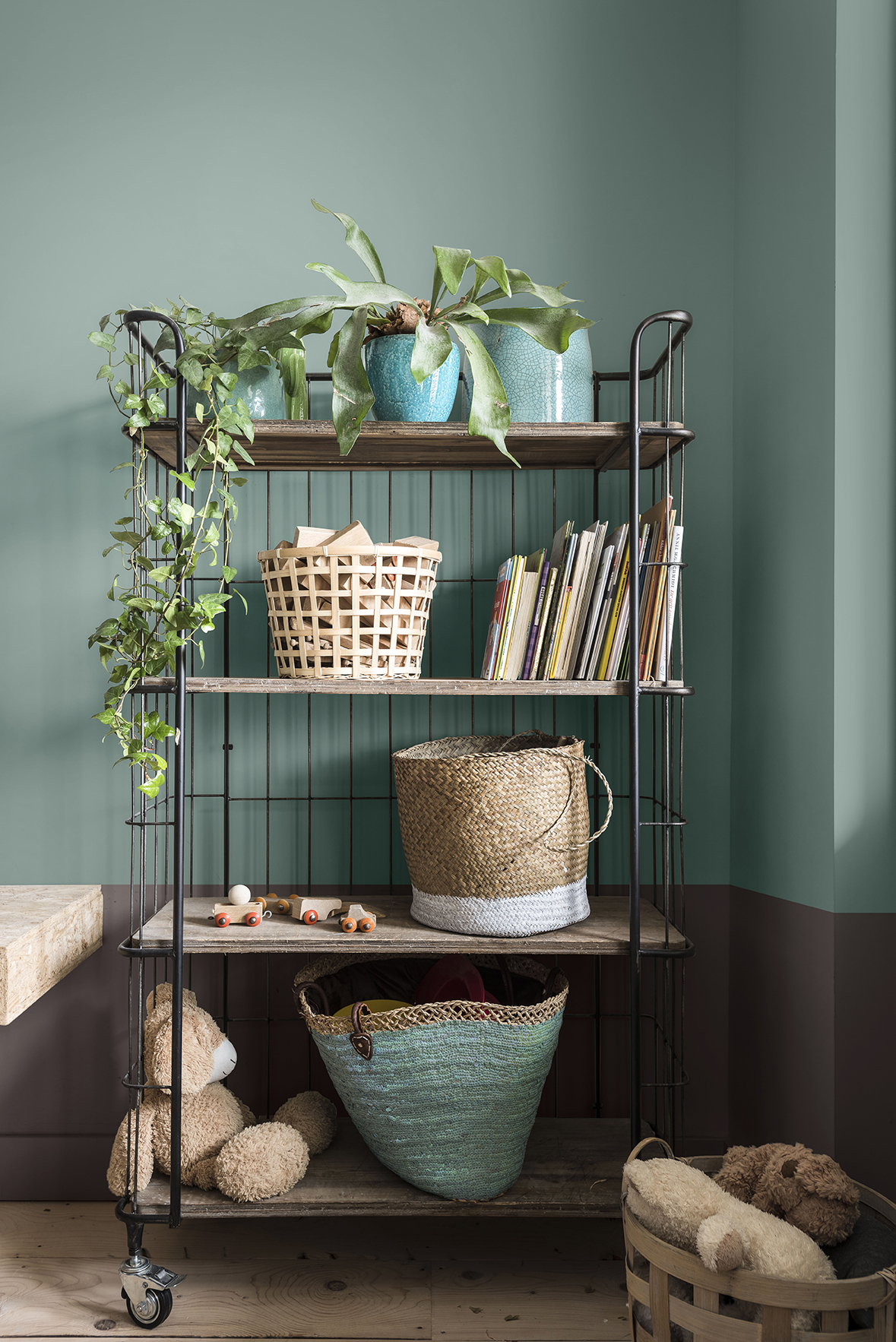
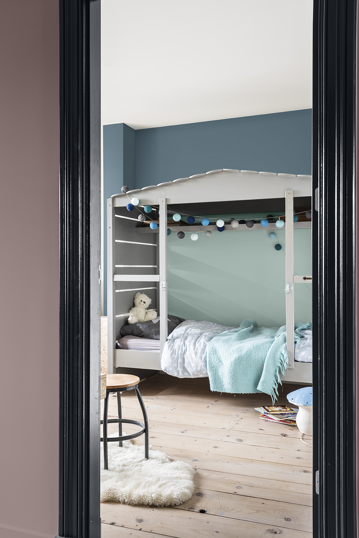
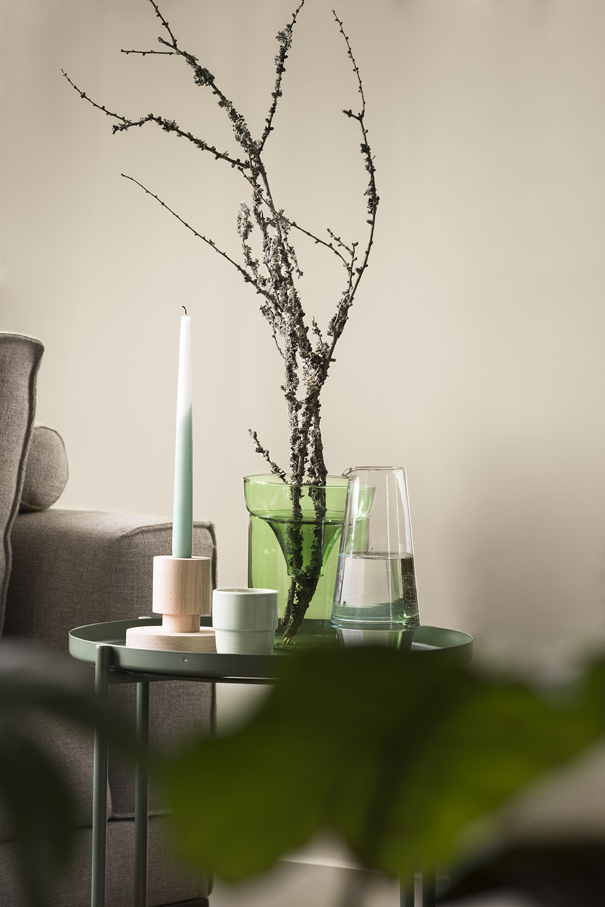
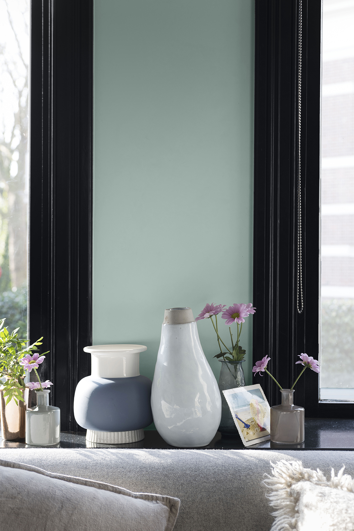
This colour palette brings comfort and convenience to life for those seeking to strengthen bonds and bring family and friends together. Cool shades of blue encourage a clear-headed approach to life, while neutrals and sea greens support the need for connecting with the outside world.
Personality of the palette:
- A space for shared quality time
- Inclusive, optimistic and collaborative
- Gather with friends and family, bringing comfort through community
- Technology is used sparingly
- Open-plan living is at the heart, preferring gentle, hard-wearing natural fabrics that feel safe

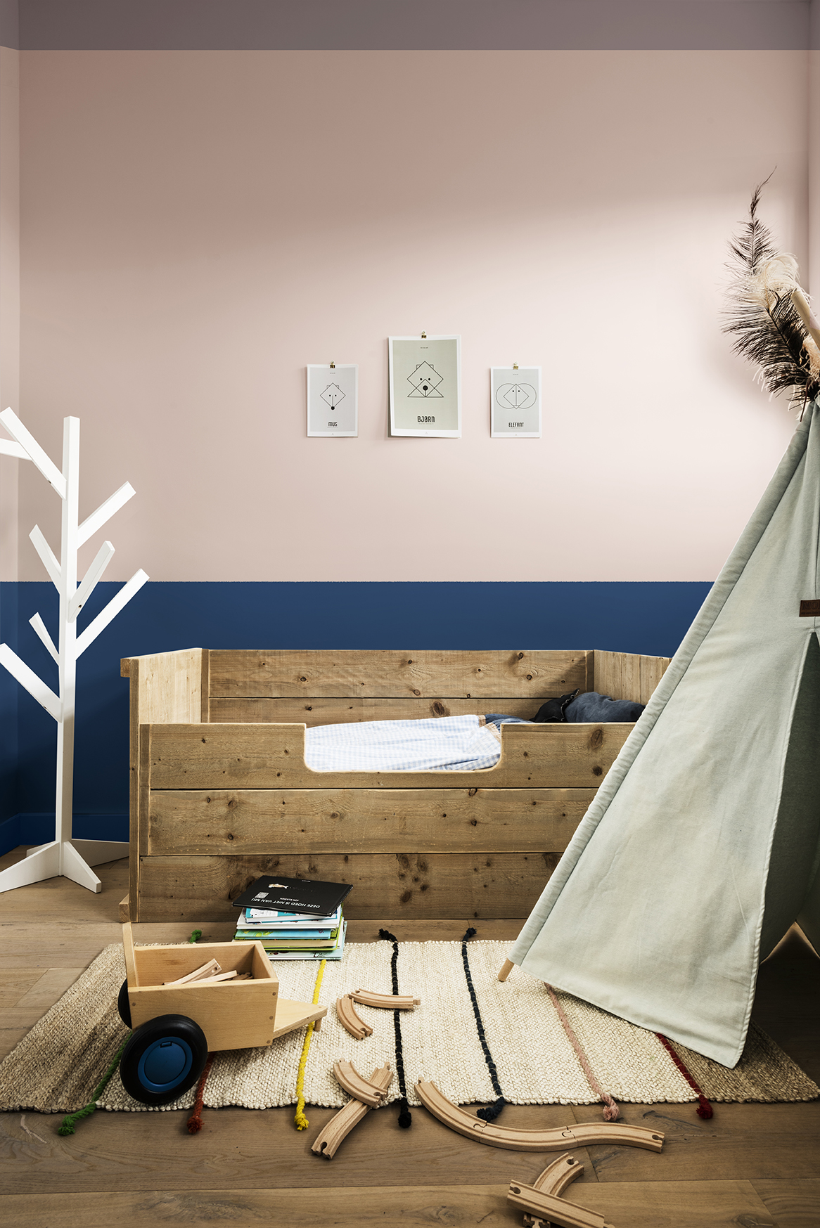
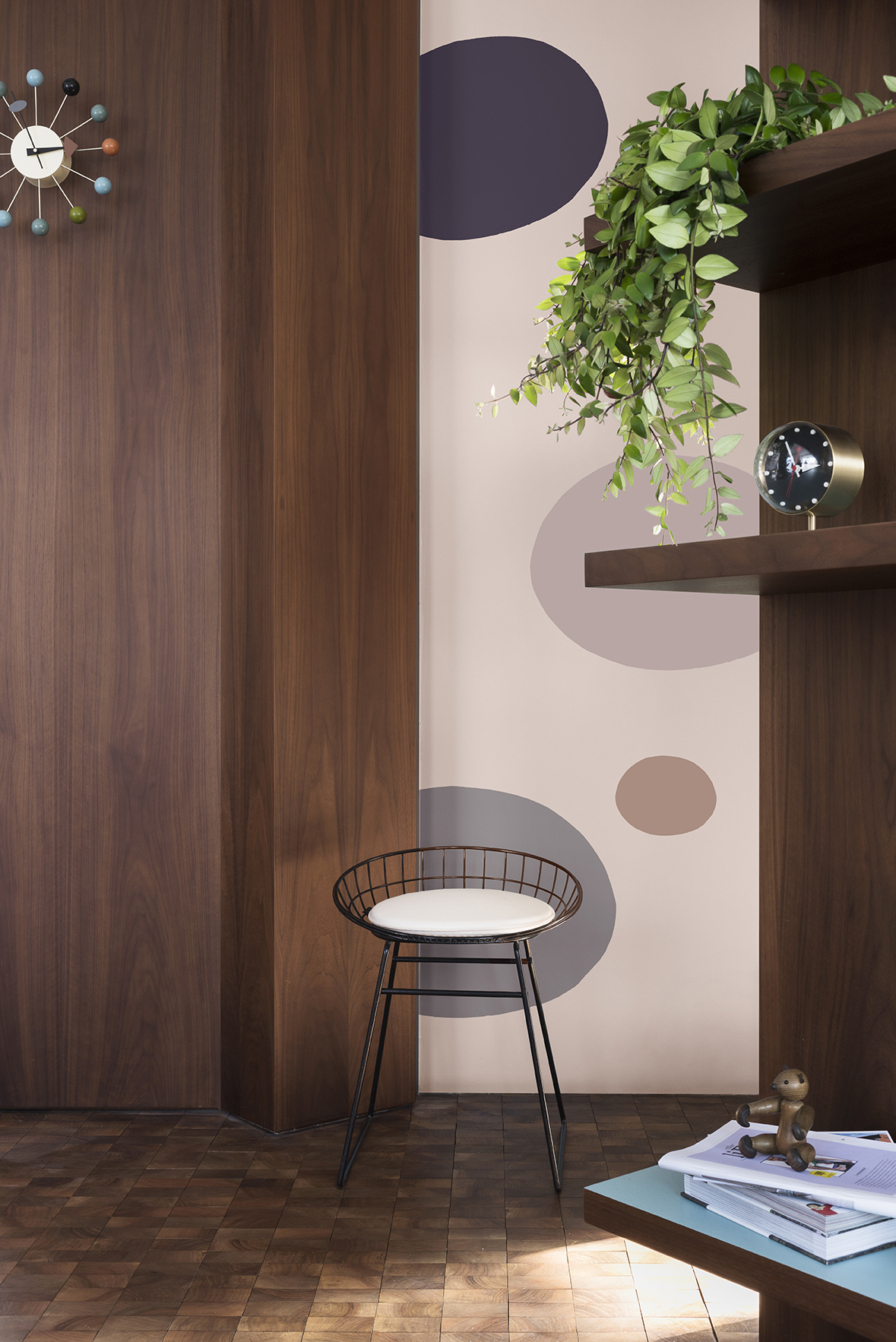
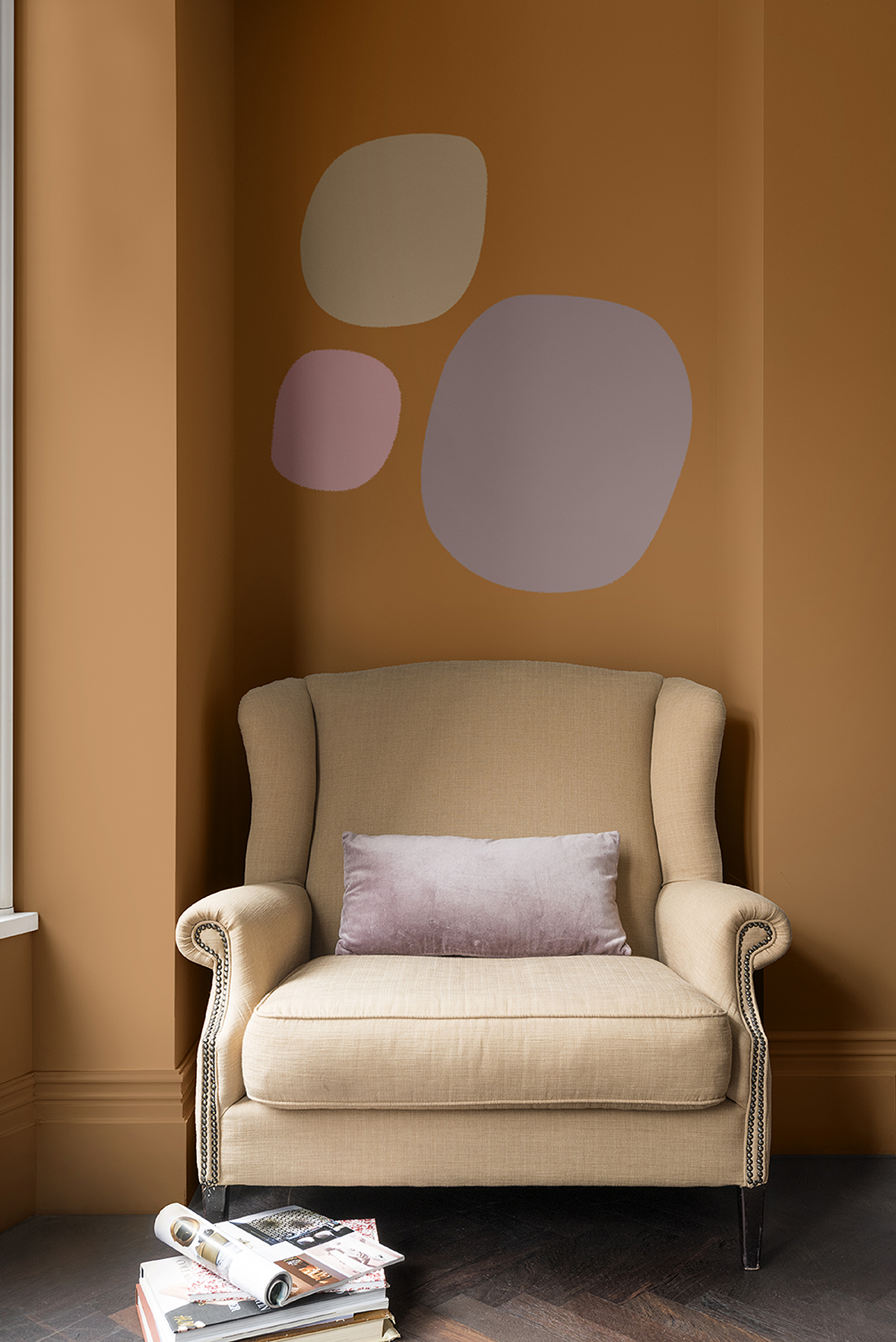
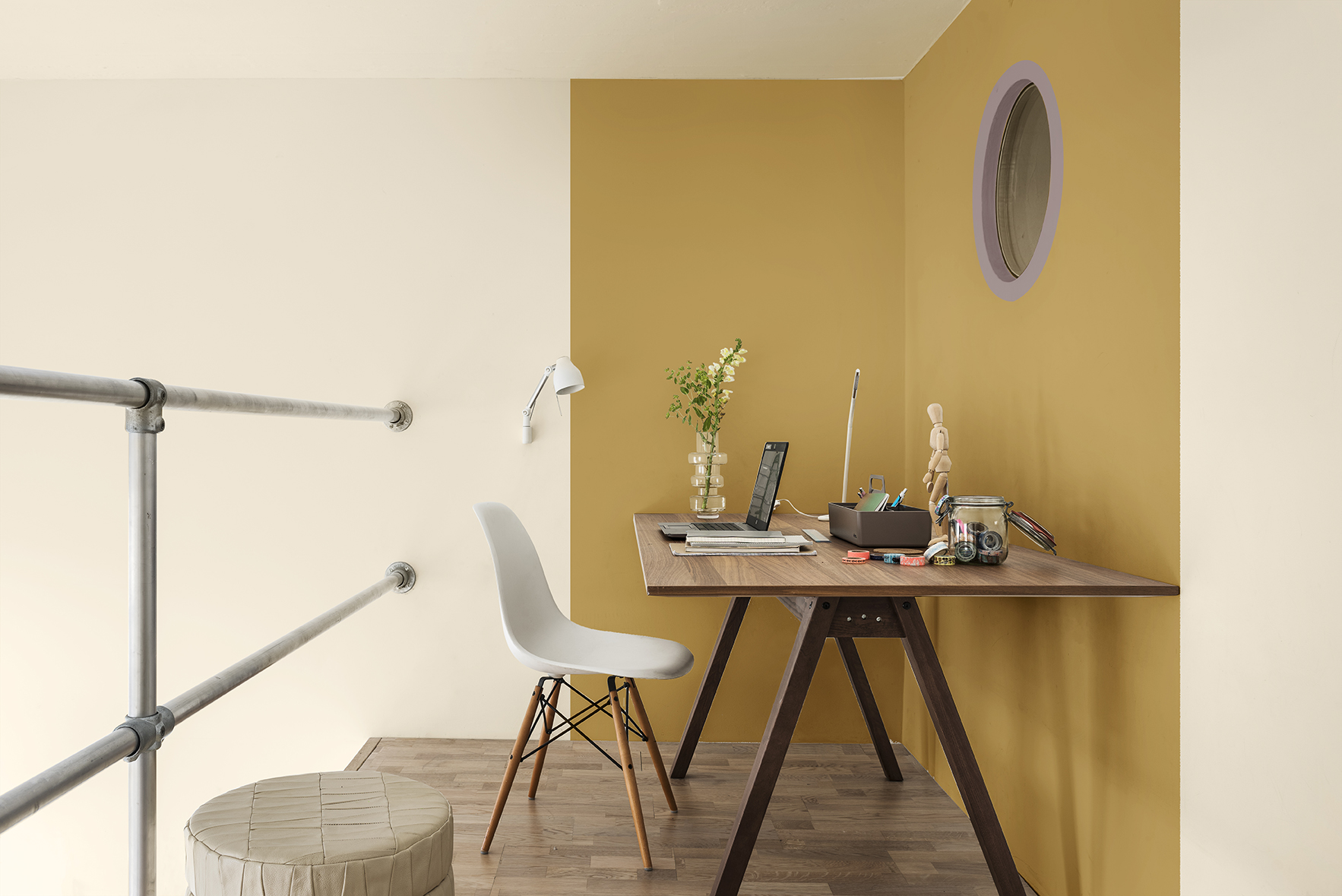
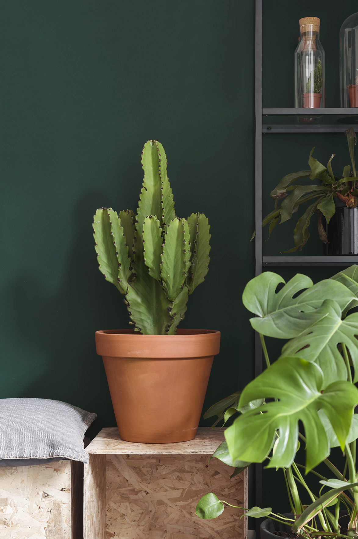
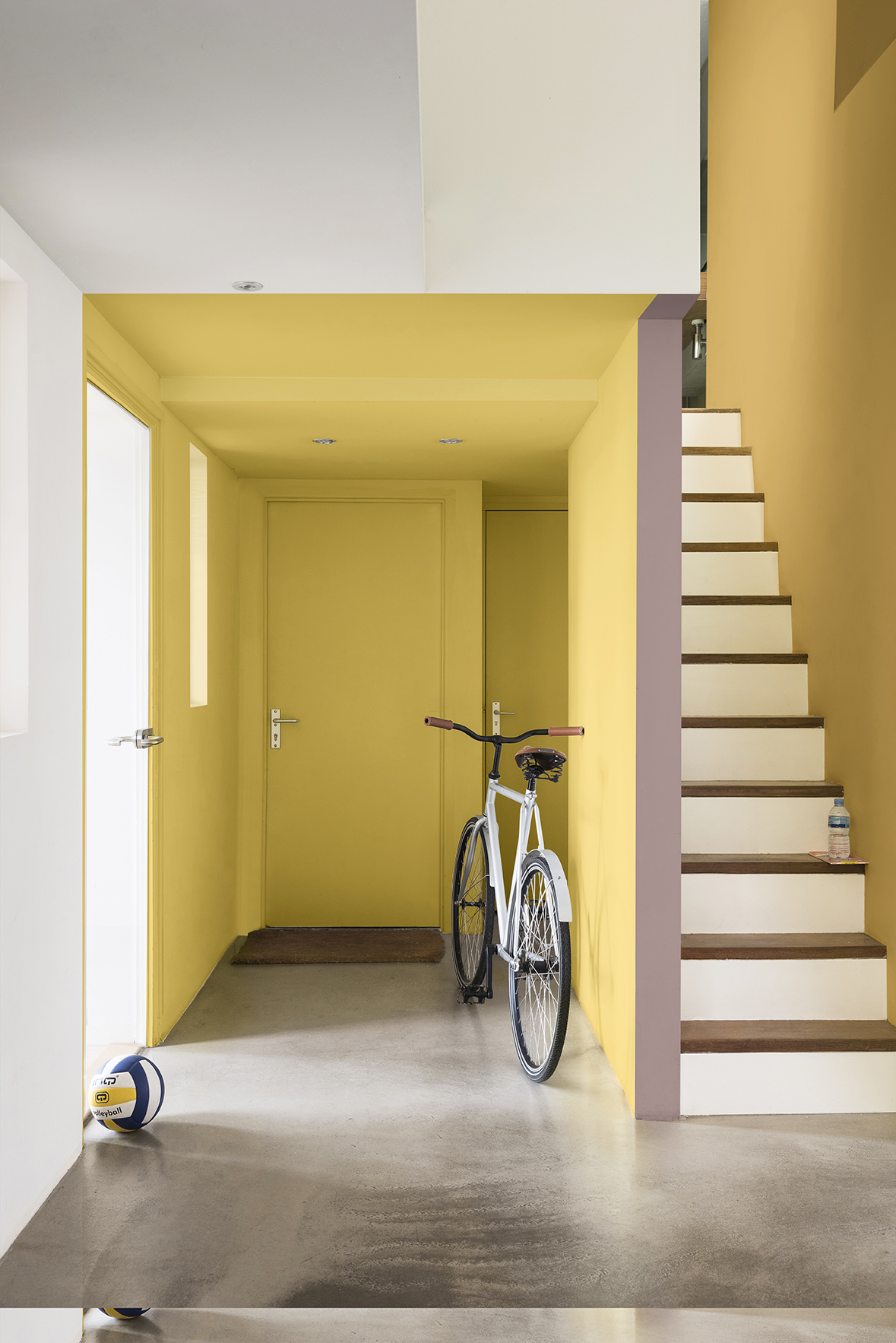
The Playful Home
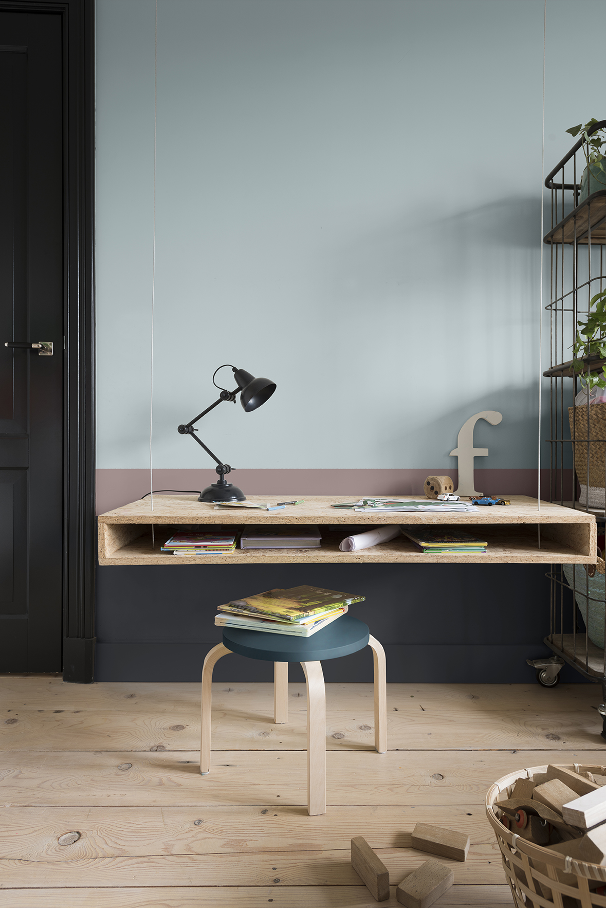
This palette creates a space to be inspired and invigorate the senses. Yellow-toned green and gold help spark the synapses and encourage a creative approach to life. Pops of colour add a sense of fun and energy, while clever use of colour can help create different zones within smaller spaces.
Personality of the palette:
- Light-hearted persona, curious, adventurous and adaptable
- Early adopters of technology that is seamlessly integrated into the home
- Seeking energy, experience and creativity
- Multi-functional, smaller spaces work with natural textures and fun patterns
15 years of global research
2018 Marks the 15th year of ColourFutures™, dedicated to the expert analysis of social, economic and design trends and the development of the Colour of the Year.
This year’s extensive research was carried out by the team at Dulux’s Global Aesthetic Centre, which is led by Creative Director Heleen Van Gent. She worked with a group of 11 global independent experts from various fields, including architecture, biophilic design, technology and innovation. This diverse group ensures a mix of perspectives from a broad range of disciplines and cultures, which brings truly universal relevance and understanding of consumer sentiment. The Global Aesthetic Centre is in its 25th year and supports 80 markets worldwide, ensuring that consumers can make paint colour choices from their homes with confidence.
About Dulux
Dulux is the South African consumer paint brand from AkzoNobel, a leading global paint and coatings manufacturer and a major producer of specialty chemicals. AkzoNobel supply industries and consumers worldwide with innovative products and are passionate about developing sustainable answers for their customers. Headquartered in Amsterdam they are consistently ranked as one of the leaders in the area of sustainability. With operations in more than 80 countries, their 50,000 people around the world are committed to delivering leading products and technologies to meet the growing demands of our fast-changing world.
About AkzoNobel
AkzoNobel creates everyday essentials to make people’s lives more liveable and inspiring. As a leading global paints and Coatings Company and a major producer of specialty chemicals, they supply essential ingredients, essential protection and essential colour to industries and consumers worldwide. Backed by a pioneering heritage, their innovative products and sustainable technologies are designed to meet the growing demands of a fast-changing planet, while making life easier.
Consistently ranked as a leader in sustainability, they are dedicated to energizing cities and communities while creating a protected, colourful world where life is improved by what we do.