
 Jade Mcgee
The entryway has a disproportionate effect on how a home feels. It is the first thing visitors see and the last thing you pass through on the way out each morning. A cluttered, undefined entry creates a low-level friction with the rest of the house that a composed one does not. The good news is that entryways require less than most rooms to work: they are small spaces where a few correct decisions produce significant results.
The challenge is restraint. The instinct in a small functional space is to add more storage, more hooks, more shelving, until the entry becomes a staging area for all the things that cannot find a home elsewhere. The result is an entry that announces the house is disorganised before anyone has moved into it. The five formulas below produce entries that are both functional and considered.
What every entryway needs
Before the formulas, the basics: every entryway, regardless of size, benefits from a clear place to put things coming in from outside, a mirror, and a surface at a height that allows you to set things down without bending. These three elements together- something to hang, something to set down, and something to see yourself in- provide the core function the space needs. Everything added beyond this should justify itself by improving either function or character, not just filling space.
Formula 1: Bench, basket and wall feature
This is the most widely practical formula for a standard-size entryway. A bench, chosen for scale rather than style first, provides a place to sit when removing shoes and anchors the space visually. A basket or contained storage underneath or beside the bench handles the shoes themselves, keeping them present but not scattered. A wall feature, which could be a mirror, a single artwork or a simple row of hooks above the bench, provides the visual element that makes the arrangement read as designed rather than functional.
The success of this formula lies in proportion. The bench should feel sized for the wall it occupies rather than too small for the space around it. The storage basket should sit lower than the seat of the bench. The wall feature should be centred above the bench and hung at eye level.
Formula 2: Cabinet, mirror, sconce and tall vessel
For an entryway that can accommodate a deeper piece of furniture, a cabinet with closed storage provides the containment that prevents the space from looking like an overflow room while offering surface area for deliberate display. A mirror above the cabinet is both functional and the most reliable way to make a small entry feel larger by reflecting light from the room beyond. A wall sconce or lamp beside the mirror introduces mood lighting. A tall vase or vessel on the cabinet surface adds height variation and organic presence.
This formula has more components, but each serves a specific purpose. The mirror cannot be merely decorative: it should be large enough to actually be functional. The lamp should be on a dimmer or low-wattage bulb for evening use. The vessel can be seasonal, holding branches or dried grasses rather than fresh flowers, which is both lower maintenance and often more interesting visually.
Formula 3: Cabinet, table lamp, art and short vessel
A variation on the above that replaces the sconce with a table lamp and the tall vessel with a smaller, lower one. The effect is more intimate and less symmetrical, which suits homes with a collected rather than formal aesthetic. A single artwork on the wall alongside rather than above the cabinet, positioned at eye level, produces a less expected arrangement. A small grouping of objects on the cabinet surface, three pieces at different heights, brings character without clutter.
Formula 4: Console table and tall plant or vessel
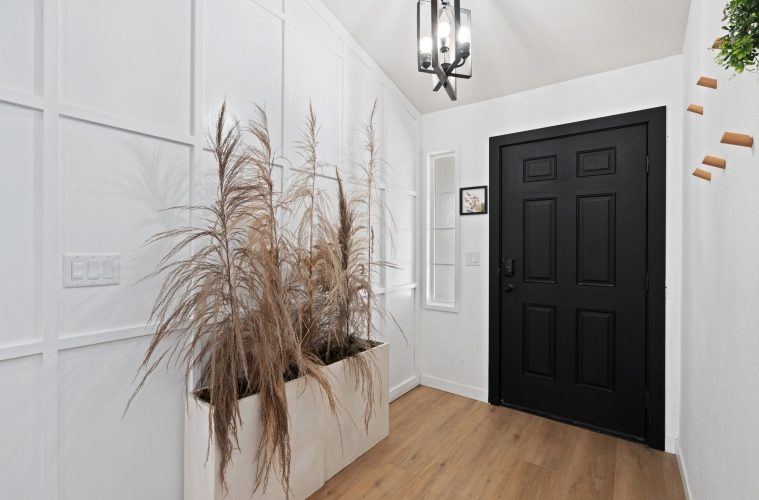
For a larger, open entryway that does not require a shoe-storage solution, a slim console table placed against the wall with a tall plant or architectural vessel alongside it produces a graphic, unfussy arrangement that is both welcoming and visually strong. This formula relies on scale for its impact: the table, the plant and the proportions of the entry itself need to be in conversation. Too small a table in a large entry looks tentative. Too large a plant overwhelms a small console.
Formula 5: Console table, chair, lamp, art and small vessel
The most expansive of the formulas. A console provides the horizontal surface, a chair provides a place to sit that is not a bench and adds a layer of comfort to the space, a lamp provides mood lighting, art provides the personal element, and a small vessel completes the surface composition. This formula requires the most space but produces the most complete and characterful entry.
The chair is the most important element here and the one most likely to be got wrong. It needs to be proportionate to the console rather than the room, and it should not be so large that it blocks movement. A slimmer armchair, a cane-backed chair or a straightforward dining chair in an interesting material all serve this role effectively.
The one principle that applies to all of them
Keep less on surfaces than feels necessary. The instinct when styling a surface is to fill it, but the entries that work best are the ones where restraint has been applied to what is displayed. Two or three objects on a surface, varied in height and material, with clear space around them, reads as composed. Five to six objects of similar heights read as crowded. The clear space is not emptiness: it is what gives the displayed objects their presence.
ALSO SEE:
Featured Image:
