Your front door is a funny little thing. It doesn’t take up much space, yet it quietly does the most – setting the tone, hinting at your style, and greeting every guest before you’ve even said hello.
Lately, homeowners are giving this hardworking feature a moment in the spotlight, armed with a paintbrush and a bit of confidence. The result? Front doors that feel intentional, expressive, and just a little bit irresistible.
Why everyone’s painting their front doors
It’s the quickest way to fake a glow-up.
You don’t need a full exterior makeover to make your home feel fresh. A newly painted front door delivers instant curb appeal – no scaffolding, no stress, no second mortgage required.
It adds personality without commitment. Think of it as the “statement earring” of your home. You can go bold, moody or playful, without locking yourself into a full façade colour scheme. It reflects a shift towards lived-in style.
Homes are becoming more personal and less “perfect.” A painted front door feels curated, not cookie-cutter – like someone actually lives there (and has good taste).
The colours everyone’s reaching for right now
This year’s palette leans confident, grounded and quietly dramatic. Nothing shouty – just colours that know who they are.
Forest green: the nature lover’s neutral
Deep, leafy greens are having a moment – and it’s easy to see why. They feel calm, rooted and timeless, like your home has always belonged exactly where it stands. Paired with stone, brick or crisp white walls, a forest green door brings an effortless, outdoorsy elegance.
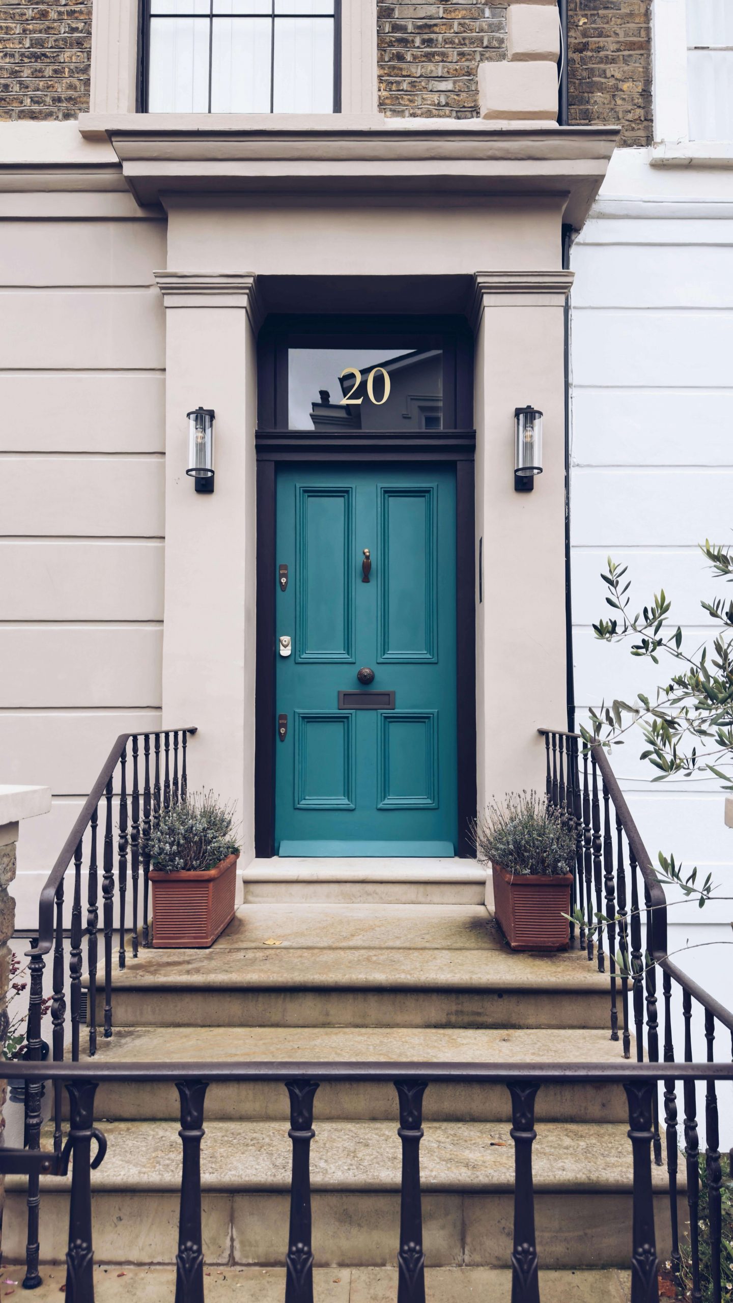
Jewel tones: bold, but make it refined
If you’re feeling brave, jewel tones are your playground. Think sapphire blue, ruby red or even a rich golden yellow. They add depth and a hint of drama, but still manage to feel grown-up. It’s colour, just with better manners.
Pexels
Classic black: forever chic
There’s a reason black never leaves the group chat. It’s sleek, grounding and works with absolutely everything. A black front door creates instant contrast – especially against lighter exteriors – and always looks polished, even on the most casual homes.
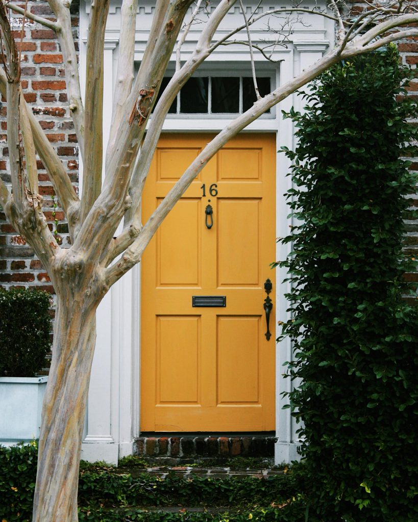
Warm earth tones: sun-baked and soulful
Terracotta, rust, deep brown – these shades feel like they’ve been kissed by the sun. They’re warm, welcoming and slightly nostalgic in the best way. Perfect for homes that lean traditional or textured, especially when paired with natural materials like wood and stone.
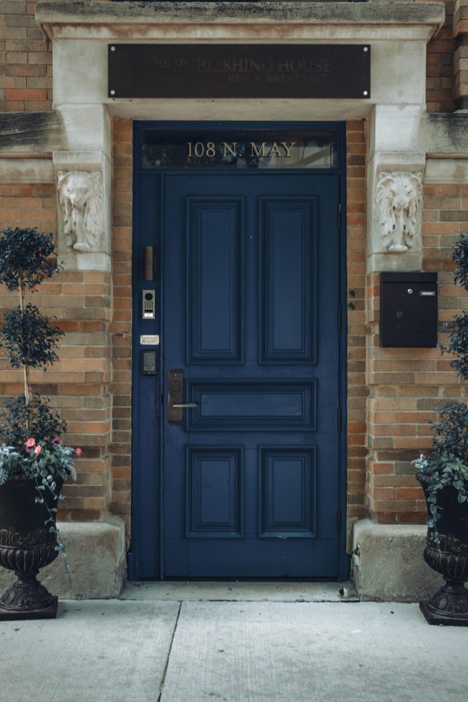
Navy blue: the safe statement
Not quite neutral, not quite bold – navy sits comfortably in between. It adds richness without overwhelming your exterior, making it a favourite for those easing into colour. On lighter homes, it offers just enough contrast to turn heads (subtly, of course).
Pexels
Charcoal grey: modern and moody
If black feels a touch too intense, charcoal is its softer, more laid-back cousin. It still delivers depth, but with a slightly more relaxed edge. Ideal for contemporary homes, especially when paired with metal finishes or minimalist landscaping.
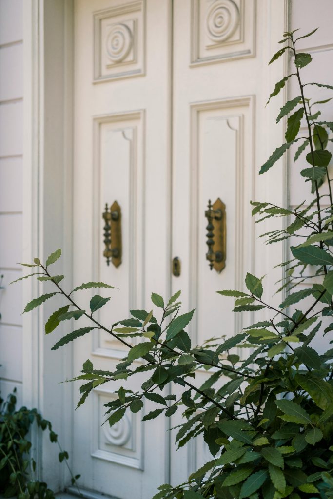
Crisp white: clean and considered
While deeper shades are trending, white hasn’t gone anywhere. It’s fresh, simple and quietly striking – especially on darker exteriors. Think of it as a blank canvas that lets architectural details and greenery do the talking.
Pexels
Painting your front door isn’t just about colour – it’s about intention. It says, “I’ve thought about this space,” without needing to say much at all.
So whether you lean towards inky black, leafy green or something a little more daring, consider this your sign to pick up a brush. Your front door deserves its main character moment.
ALSO SEE: COLOUR DRENCHING: THE BOLD EXTERIOR TREND YOUR HOME NEEDS