
 Jade Mcgee
Pattern gives a room personality, but combining several prints can make even confident decorators hesitate. A floral curtain, a striped cushion and a checked chair might seem to be competing for attention until one simple detail brings them together: scale. Rather than following a strict ratio for how much of each print to use, think about the size of the motifs and how the eye moves between them.
Start with one print that sets the tone
Choose a fabric, rug or wallpaper that you genuinely love and let it inform the room’s palette. A large botanical pattern can work as the leading feature, while smaller geometrics and narrow stripes provide contrast. Draw one or two colours from the main print into the others. This creates a visual connection even when the designs come from different periods or styles.
Contrast large and small motifs
Two similarly sized, high-contrast prints often compete because neither has a clear role. Instead, pair an oversized floral with a fine check or a bold stripe with a delicate leaf print. The differences help each pattern remain legible. A medium-scale motif can bridge the gap between the dominant print and the smallest detail, particularly in rooms with several upholstered pieces.
Match the pattern to the surface
Large repeats tend to read well across broad curtains, sofas and rugs where there is enough fabric to appreciate the full design. Smaller motifs often suit cushions, lampshades and an occasional chair. These are useful starting points rather than unbreakable rules. A big geometric cushion can be exactly the unexpected touch a restrained room needs, provided nearby elements are quieter.
Give the eye somewhere to rest
Solid-coloured upholstery, a plain painted wall or a textured neutral rug can be essential when prints multiply. Natural woven textures and softly coloured linens create breathing space without leaving the room feeling bare. Try repeating the same background shade in different fabrics, then let one print introduce a contrasting accent. That small departure often makes a carefully layered scheme feel personal rather than formulaic.
Test patterns in the room itself
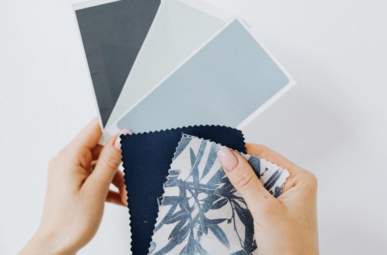
Samples may look convincing on a desk and completely different under evening lamplight. Bring fabrics together beside existing furniture, then stand back. Consider which print catches your eye first and whether the other patterns support it. Photographing the combination can make an imbalance easier to spot. Above all, scale is a tool for creating rhythm, not a reason to eliminate the surprises that make a room feel lived in.
