
 Jade Mcgee
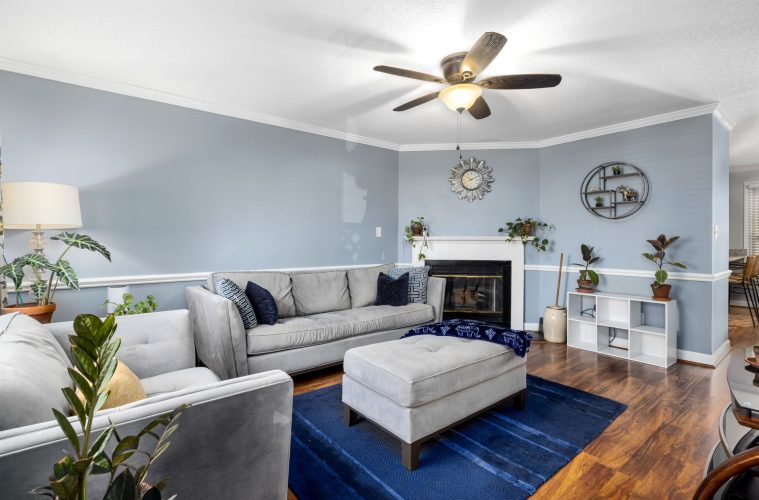
Blue has a reputation for bringing calm to a room, but it can also read a little chilly when it is surrounded by hard finishes, bright white and very little texture. That does not mean it has to be reserved for bathrooms or breezy coastal schemes. With the right pairings, blue can feel grounded, generous and surprisingly cosy.
The trick is not to fight its coolness, but to balance it. Warm materials, tactile finishes and a considered mix of neighbouring colours can shift blue from crisp to comforting without making a room feel heavy. That is especially useful in spring, when you may want warmth without returning to a dark winter palette.
Warm blue with natural wood
Wood is one of the quickest ways to soften a blue room. A blue kitchen, for example, feels less clinical when cabinetry sits alongside timber floors, open shelving, a wooden island or woven seating. The same principle works in bedrooms and living rooms through bedside tables, frames, baskets and occasional furniture.
The finish matters too. Honeyed, medium and darker woods add obvious warmth, while pale timber keeps the look lighter. Brass, aged metal and warm ceramics can play the same supporting role in smaller doses. Instead of asking blue to create the mood on its own, let the surrounding materials do some of the warming work.
Use warm neutrals instead of stark white
Blue and white is a classic combination, but a brilliant white can sharpen the contrast and make a cool blue appear colder. Cream, oatmeal, mushroom, taupe and soft beige create a gentler transition. They are particularly effective in textiles, where curtains, rugs, upholstered pieces and bed linen can introduce warmth without another painted surface.
Muted pink, rust, ochre and earthy coral can also work as accents. You do not need much. A cushion, patterned rug or artwork that repeats one of these warmer notes can stop a blue scheme from feeling one-dimensional.
Let South African light guide the shade
Blue changes dramatically through the day, so paint samples are worth living with before committing. In South African homes, north-facing rooms generally receive the most sun, while south-facing rooms tend to get softer, cooler light. The same blue can therefore look lively in one room and greyed down in another.
Test a generous sample on more than one wall and, if you are considering a blue ceiling, test there too. Look at the colour in morning light, late afternoon and after the lamps come on. A shade with a dusty, grey-green or slightly warm undertone often feels easier to live with than an icy, highly saturated blue.
Build softness through texture
Texture makes a cool palette feel more touchable. Linen, wool, velvet, boucle, rattan and woven grass bring visual depth that flat paint and polished surfaces cannot create on their own. In a bathroom, a blue tile can feel warmer next to timber or a textured blind. In a lounge, a blue sofa becomes more relaxed when layered with a wool throw and a nubby neutral rug.
Even when you love a sleek look, introducing one or two softer surfaces can reduce the hard-edged feeling that sometimes makes blue seem distant.
Repeat blue instead of isolating it
A single blue wall can look disconnected if nothing else in the room acknowledges it. Repeating the colour in smaller amounts helps it feel intentional. A blue ceiling might be echoed in a stripe, a vase or a pattern on a chair. A navy cabinet can be picked up by artwork or a rug without matching exactly.
The goal is not to turn every surface blue. It is to let the colour travel through the room so the eye reads it as part of a complete palette. When warmth, texture and repetition are doing their jobs, blue stops feeling cold and starts feeling comfortably settled.
ALSO SEE:
Featured Image: Pexels
