Grey had a long run. Through the 2000s and 2010s it was the default backdrop of virtually every show home, renovation reveal and interior design mood board going. It read as modern, versatile and safe, and for a while it genuinely was. But a shift has been underway for several years now, and in 2026 it has become undeniable: grey is out, and a warmer, more nuanced family of neutrals has taken its place.
The change is not simply a trend cycle. It reflects something deeper about how we want our homes to feel. During and after the years of lockdowns and extended time at home, our tolerance for cold, impersonal spaces dropped sharply. The sterile clarity of cool grey stopped feeling contemporary and started feeling clinical. Designers began reaching for tones with more warmth, more depth and more comfort, and the market followed them there.
Why warm neutrals are winning
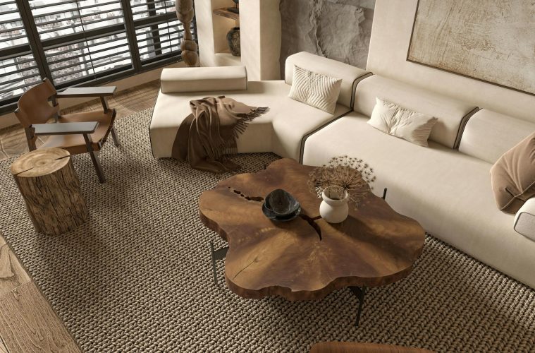
The appeal of warm neutrals over cool grey comes down to what they do to a room psychologically. Warm tones, including creamy whites, greige, soft earthy pinks, green-inflected neutrals and the caramel and tan shades increasingly categorised as new neutrals, make a room feel inhabited and welcoming in a way that cool grey rarely manages. They interact with natural light differently too, intensifying in warmth as the light changes through the day rather than pulling blue and cold.
Interior designers describe the shift as a move toward colours that feel grounding and timeless rather than fashionable. Warm neutrals have a quality that makes them harder to tire of precisely because they are less emphatic. They create a background rather than a statement, allowing furniture, textiles and artwork to take prominence while the walls quietly hold everything together.
Warm whites and creamy tones
The first and most accessible replacement for grey is not quite white and not quite cream: a warm white with just enough brown undertone to feel soft without going yellow. This category of paint has become one of the most requested shades in residential interiors, occupying the sweet spot between brightness and warmth.
These tones work particularly well in north-facing rooms in the South African context, where the light is cooler and more indirect. A cool, pure white in a north-facing space can feel stark and slightly cold; a warm white with brown undertones reads as clean and luminous while adding the sense of ease that purely white walls often lack. The key when choosing within this category is to hold your sample card against a sheet of plain white paper to identify the undertone clearly before committing. Look for tones that lean towards buff, cream or the softest parchment rather than those with any pink or yellow lean.
Greige: the bridge between two worlds
For those who still value the crispness and flexibility of grey but want more warmth, greige remains a strong and enduring choice. Greige, a blend of grey and beige, brings the best qualities of both shades together: the visual lightness and versatility of grey, combined with the organic warmth of beige. It reads as sophisticated without coldness, and it works as a backdrop for an enormous range of furniture and accent colours.
The caution with greige is undertone, which matters enormously in this category. Greige shades can lean towards purple, red or yellow depending on the specific formula, and any of these leans can cheapen the effect significantly. The best greiges have a clear brown or warm grey base with no colour cast that becomes visible in different lighting conditions. Test samples in your specific room and observe them at multiple times of day before deciding.
Green-toned neutrals
Perhaps the most surprising entrant in the new neutrals conversation is the green-toned neutral: whites and beiges with a discernible green or sage undertone, as well as soft moss and olive tones used as full wall colours. These have been gaining momentum among designers for their ability to feel simultaneously fresh and calming, and to work effortlessly with natural materials, timber and organic textures.
A white with a green undertone brings a freshness to a space that neither warm white nor greige provides, while remaining firmly in neutral territory. Fuller green tones, particularly the muted olive, sage and khaki range, work beautifully in living rooms and studies where a sense of depth and enclosure is welcome. They read differently to grey in that they feel connected to the natural world rather than to the industrial one.
Soft earthy pinks
Earthy, muted pinks have crossed over from accent status to genuine neutral territory in 2026 interiors. These are not the blush pinks of a few years ago but something more complex: pinks with a significant grey or brown component that reads as almost dusty or plaster-like on the wall. They bring warmth with a gentleness that neither beige nor warm white quite achieves, and they photograph beautifully in the soft autumn and winter light that characterises South African mornings.
These tones work with virtually any accent colour and have a particular affinity with the warm terracotta, rust and deep green shades that are running through interior design at this moment. They are also genuinely flattering to skin tones in the way that pure white and grey walls rarely are, which makes them particularly successful in bedrooms and bathrooms.
Caramel and brown tones
At the warmer, richer end of the new neutral spectrum, caramel, honey and mid-brown tones have found serious favour with designers looking to create cocooning, intimate spaces. These shades do what grey was never able to do: they create genuine warmth and a sense of envelopment that makes spaces feel restorative rather than simply decorative.
Used full-strength on all four walls, these tones produce a richness and depth that is very difficult to achieve with cooler shades. Paired with natural linen, warm timber, woven textures and deep-toned soft furnishings, they create rooms that feel genuinely luxurious without relying on expensive materials. They represent perhaps the clearest departure from the grey aesthetic, and they are proving to be one of the most enduring choices of the current cycle.
ALSO SEE:
Featured Image: Pexels