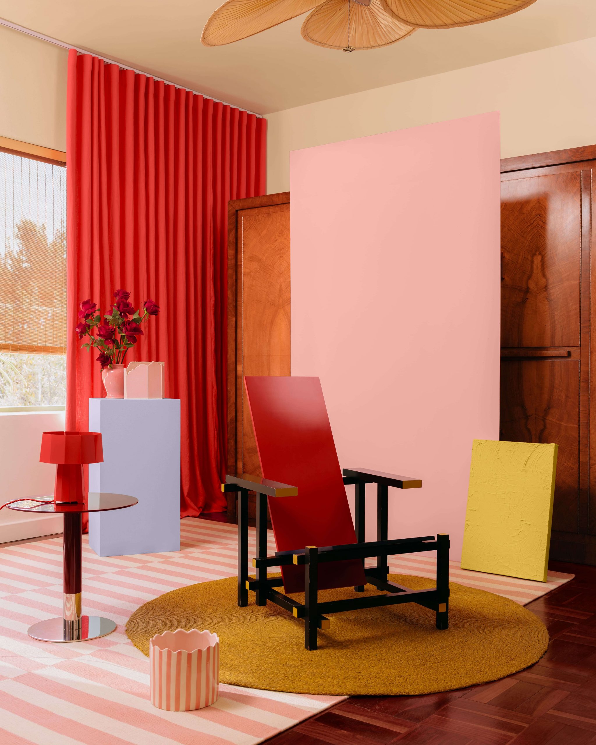
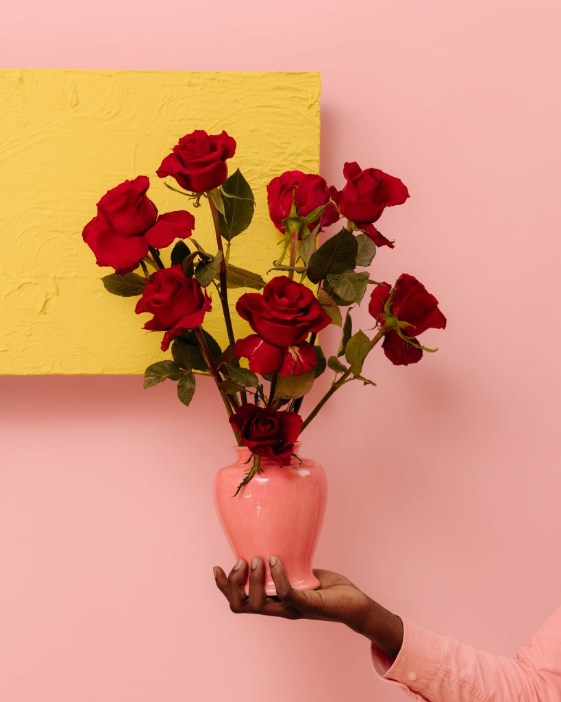
February is the Month of Love, and red and pink have always been it’s defining shades. In 2026, those colours are moving beyond their Valentine’s associations of roses and chocolates to take on a new role in interiors. They are being used in everyday spaces to bring warmth, intimacy and personality into the home.The next chapter of the Plascon Colour Forecast for 2026 radiates unapologetic confidence.
Labelled Fashion + Candy, this is a world of colour shaped by movement, nightlife energy and the expressive language of personal style.
Fashion + Candy is where colour becomes both attitude and accessory. Infused with references drawn from street style, after-dark cityscapes, and the sweet-shop nostalgia of glossy, candy-wrapped hues, this paint palette celebrates the drama and delight of dressing up. It’s the world of neon-lit evenings, of lacquered reds and electric blues, of unexpected contrasts between urban architecture and the playful optimism of pop colour.
The palette brings together seven standout tones that have been pulled from existing Plascon colours:
- Eclaire (R7-D1-1)
- Ruby Tuesday (R5-B2-2)
- Bellagio Blue (B6-B2-1)
- Hot-N-Spicy (R6-B1-1)
- White Maas (Y2-A2-2)
- Lemon Essence (Y5-A1-2)
- Ginger Biscuit (O1-C1-1)
Together, these shades reveal a world that is vibrant, eclectic and entirely unafraid of making a statement.
In the same way that fashion runways are pairing tailored silhouettes with high-shine details, Fashion + Candy thrives on contrast. Think warm reds grounded by creamy neutrals, or sweet sherbet tones offset by punchy, nightclub blues. It’s a palette designed for those who want spaces that feel energising and expressive, where colour becomes a celebration rather than a backdrop. Fashion + Candy is glossy, confident and joyfully unexpected. It is a colour story crafted for the bold. It brings pulse and play.
Fashion + Candy is one of four different worlds that make up the 2026 forecast. It joins Butter + Sky, Land + Sea, and Orchard + Bloom, to make up the full forecast for the year. Each world explores the growing shift toward bolder, more purposeful colour in interiors and personal environments. Taken together, they reflect a cultural moment where people are embracing brighter choices and finding inspiration in fashion, nature and the visual worlds shaping contemporary design.
ALSO SEE: