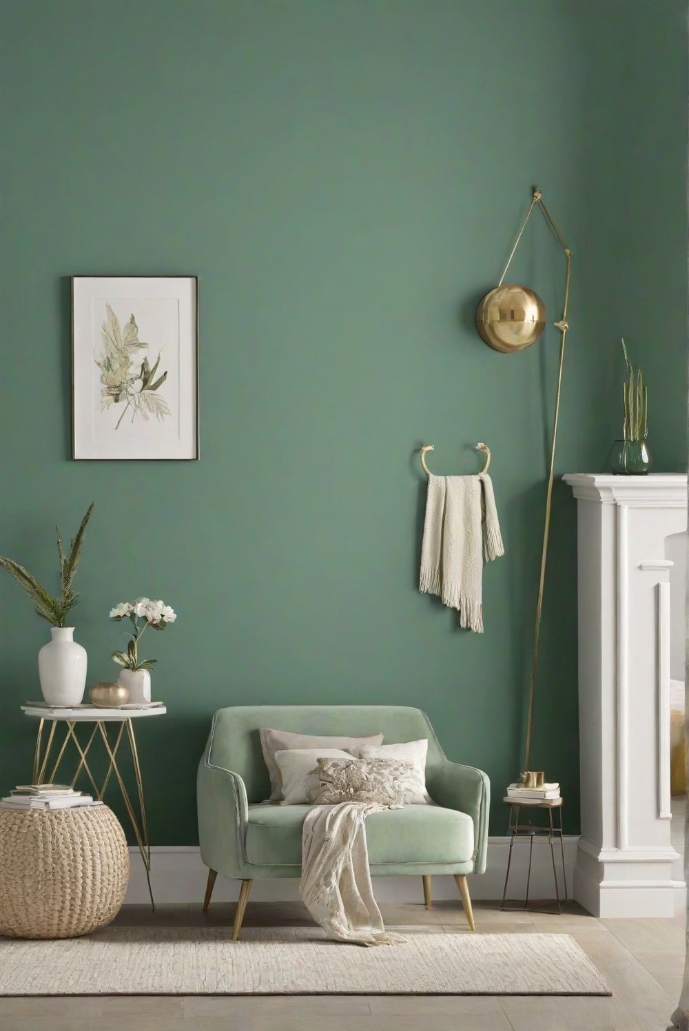
If you’re planning a home refresh this year, colour is a good place to start. Pinterest has just revealed its Pinterest Palette for 2026, and the shades point to a clear shift in how we’ll decorate our homes in the months ahead.
According to the platform, the colour forecast is based on billions of searches and saves made by users around the world. By tracking what people searched for between September 2024 and August 2025, and comparing it with the year before, Pinterest identified the hues seeing the biggest rise in interest.
The result? Five standout colours that are set to shape interiors in 2026. Here’s what they are, and how to use them at home.
Cool Blue
Clean, calm and quietly modern, cool blue is stepping into the spotlight. Pinterest reports a sharp rise in searches linked to icy, coastal-inspired interiors. Softer than navy but more interesting than white, this shade works beautifully on kitchen cupboards, bathroom walls or even as a feature colour in a living space. It brings a sense of freshness without feeling cold.
Jade
Somewhere between green and blue, jade feels grounded and refined. According to Pinterest, interest in jade décor and textures has surged, suggesting a growing love for earthy tones with depth. This colour pairs well with natural materials like stone, timber and linen. Think side tables, décor accents or even a painted cabinet for a subtle statement.
Plum Noir
Moody colours are still having a moment, and plum noir leads the way. This deep, dramatic shade blends purple with rich brown undertones, creating warmth and atmosphere. Pinterest data shows strong growth in searches for dark plum and burgundy shades. Used on walls, in soft furnishings or through layered textiles, it adds instant character to a room.
Wasabi
Bold and energising, wasabi green isn’t for playing it safe. According to Pinterest, interest in bright green tones has climbed quickly, pointing to a return of playful colour. The key is balance. Use it sparingly on tiles, décor pieces or painted niches to lift neutral spaces without overwhelming them.
Persimmon
This vibrant mix of red and orange brings warmth and personality into the home. Pinterest notes growing interest in persimmon-inspired colour palettes, especially in styling and décor. It works well in small touches, like lighting, artwork or tableware, and pairs beautifully with natural textures and warm neutrals.
As these colours rise in popularity, one thing is clear: 2026 interiors are moving towards confident choices that still feel liveable. Whether you embrace one shade or mix a few, these trending tones offer an easy way to keep your home feeling current, considered and full of life.
ALSO SEE: EFFECTIVE METHODS TO CLEAN YOUR PAINT BRUSHES AFTER DIY PROJECTS
Effective methods to clean your paint brushes after DIY projects

