The 1970s produced some of the most distinctive interiors of the twentieth century: warm, earthy, tactile rooms full of natural materials, organic shapes and a colour palette that felt rooted in the landscape. Mustard yellow, terracotta, avocado green, chocolate brown. For decades, these shades were something to move away from. Now, quietly and convincingly, they are back.
What is different this time is the approach. Contemporary designers are not recreating the aesthetic wholesale but drawing from its colour logic selectively, grounding those characteristic warm tones in more restrained, modern contexts. The result is interiors that feel current rather than costumed. Here is how the palette is being used, and how to apply it at home.
Ochre: treat it as a neutral, not a feature
Mustard yellow was the most recognisable colour of the 1970s interior, and it is the one that most easily reads as dated when handled carelessly. The contemporary approach is to shift away from saturated mustard towards muddier, more grounded ochre tones that function as warm neutrals rather than bold statements.
Ochre works best when it leads the room and is balanced by contrast rather than surrounded by competing warm tones. Orange-toned woods, warm whites and overly honey-hued accessories all flatten the effect and push it back towards the decade it came from. Pairing ochre walls or upholstery with crisp plaster white, deep espresso wood or matte black keeps the colour feeling sharp and intentional. Colour-drenching a single room or alcove in ochre, walls, trim and ceiling in the same tone, creates an enveloping warmth that reads as considered rather than retro.
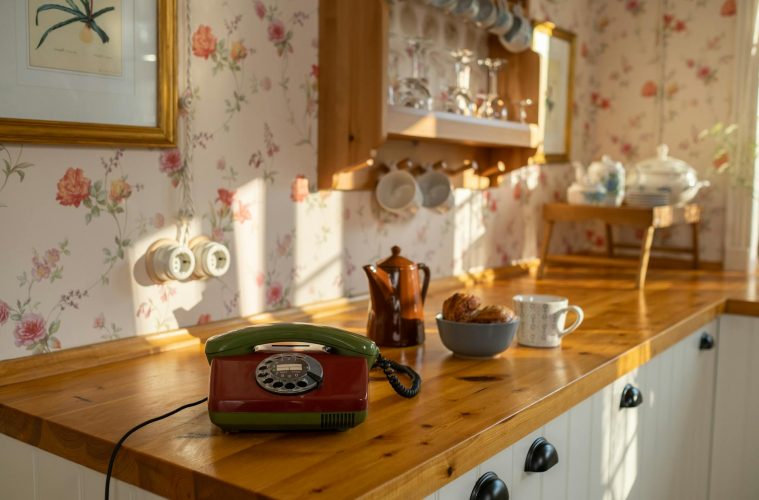
Muted grey-green: the quiet workhorse
Green was central to the 1970s interior and remains one of the most versatile colours in current design. The contemporary version favours grey-toned, slightly desaturated greens that hover between foliage and stone, working as sophisticated neutrals that bring warmth without the heaviness of deeper tones.
These muted grey-greens work particularly well in kitchens and living spaces where they complement natural wood tones without competing with them. The key is repetition: using the same green across cabinetry, tiling and trim creates a sense of coherence and intention that a single accent wall cannot achieve. If a slightly warmer expression is needed, sage greens with a yellow undertone rather than a blue one tend to sit more comfortably alongside timber and earthy accessories.
Earthy brown: depth without heaviness
Brown is perhaps the most rehabilitated colour in contemporary interiors. Long associated with the dated side of 1970s design, it has re-emerged in richer, more sophisticated expressions that add depth and intimacy to a room without the oppressive quality of its predecessors.
Chocolate brown in particular has found a new role as a wall colour, used to create a sense of enclosure and warmth in bedrooms and dining rooms. The difference between a brown room that feels luxurious and one that feels heavy comes down to what it is paired with. Crisp white or off-white trim creates the contrast that keeps the depth from becoming overwhelming. Tailored upholstery, modern artwork and clean-lined furniture prevent the warmth from tipping into nostalgia. The guiding principle is balance: brown as an envelope for the room, with lighter and more refined elements providing relief within it.
Moss green: as an accent, not a backdrop
Warmer, more yellow-toned greens, avocado, olive and moss, were omnipresent in 1970s interiors and carry a stronger period association than their greyer counterparts. Used across an entire room, they can feel emphatically retro. Used as an accent, they add a distinctive warmth that grounds a neutral scheme and avoids the anonymity that too much beige and white can produce.
A moss green fireplace surround, a set of kitchen cabinet doors, a single upholstered chair or a run of tiling are all applications that allow the colour to contribute character without dominating. The surrounding palette should be calm and relatively neutral, giving the accent room to register. Pairing moss green with off-white walls, natural linen, rattan and warm wood tones creates a layered, earthy scheme that feels rooted in the 1970s without being confined to it.
Terracotta: use it to drench
Terracotta is the 1970s colour that has aged most gracefully into contemporary design, possibly because its warmth and organic quality feel timeless rather than period-specific. In its current incarnation, it is being used most effectively through colour-drenching: applying a single deep, dusty terracotta tone across walls, trim and sometimes ceilings to create an immersive, cocooning effect.
The depth that makes this approach work comes from choosing the right tone. Terracottas with a slight grey or brown undertone, closer to fired clay than to orange, feel more sophisticated and easier to live with than their brighter counterparts. Paired with natural stone, dark wood and earthy textiles, and balanced with greenery and softer neutrals, a terracotta-drenched room captures the warmth of the decade at its best without any of the associations that make it feel dated.
Making it work without it feeling themed
The underlying logic of the 1970s palette, earthy, warm, layered and deeply connected to natural materials, is what makes it so compelling in the current design climate. The risk is tipping from inspired-by into recreating, which requires only a few too many period references in the same room. The most reliable safeguard is contrast and restraint: one or two colours from the palette, balanced with clean neutrals, modern silhouettes and contemporary materials, creates a room that references the decade without being defined by it. Choosing colours with enough complexity to function as proper neutrals, rather than as obvious period signifiers, is what ultimately allows the palette to feel current.
ALSO SEE:
Why painting your front door might just be the glow up your home needs (+ most popular colours)
Featured Image: Pexels