
 Jade Mcgee
Negative space is, at first, a confusing idea in interior design because it sounds like nothing. Space implies emptiness, and emptiness implies absence. But negative space is not the absence of design. It is a design decision, the deliberate choice to leave some part of a room unoccupied, unarticulated or quiet, so that the parts you have filled read with more clarity, more weight and more intention.
It operates in rooms the way breath operates in music. Remove it and what remains becomes dense, relentless and, eventually, unreadable. Introduce it and everything else makes more sense.
Drawing attention to what you love
One of the most direct applications of negative space is as a frame. Whatever you place in an area of cleared, unoccupied space, whether a single artwork on an otherwise bare wall, a statement piece of furniture with clear floor area around it, or a single object on an otherwise minimal shelf, gains presence simply through the contrast between what it is and what surrounds it.
This works because the eye has limited capacity to give simultaneous attention to multiple things. When a room asks it to attend to too many objects at once, none of them registers with full impact. When a room gives some objects breathing room, those objects gain visual hierarchy. The principles of museum display exist precisely because of this: you would not encounter a great painting in a crowded room of equally insistent objects. The space around it is part of the artwork’s presence.
Floating furniture away from walls
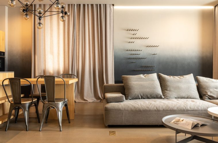
The most counterintuitive and consistently effective advice in furniture arrangement is to pull pieces away from the walls. Furniture pushed to the perimeter of a room, arranged around the edges, makes the centre feel empty rather than open and removes the sense of a defined, gathered zone for inhabiting the space. A sofa floated even half a metre from the wall creates a seating area with purpose and presence. A chair pulled inward, angled toward another piece of furniture, creates a conversation space.
The area behind and around pulled-forward furniture does not become wasted space. It becomes the negative space that gives the arrangement its coherence and makes the room feel proportioned and composed rather than furniture-storage.
Letting architecture speak
Rooms with strong architectural features, good ceiling heights, generous windows, well-proportioned arches or distinctive doorways, need less furniture to feel complete. These features have their own presence and their own ability to make a room feel designed. When furniture and decoration crowd around or in front of them, the architecture is competing with the contents. When the architecture is given space around it and in front of it, it becomes the design.
The practical application is restraint near architectural moments: not flanking a beautiful window with tall furniture that draws the eye away from it, not placing a bookcase across an arch that was doing all the structural and visual work it needed to do.
Hanging artwork lower and off-centre
The standard advice is to hang artwork at eye level and centred. Following this creates a competent, predictable result. The more interesting application of negative space is to hang a smaller work lower on a wall, or dramatically off to one side, so that the surrounding emptiness becomes part of the composition. The blankness around a small piece hung with intention does not make the wall look unfinished. It makes the work look considered in a way that a crowded gallery wall cannot achieve.
This logic extends to the much-discussed trend for smaller artworks: they work precisely because the space around them is doing part of the visual work, making the piece seem deliberately placed rather than merely occupying a gap.
Giving patterns room to register
Pattern in furnishings, cushion prints, a patterned rug, bold wallpaper, needs plain surfaces nearby to allow it to register clearly. Two strong patterns placed immediately beside each other compete in a way that can feel chaotic. The same two patterns, separated by a plain surface or an expanse of floor, set up a visual rhythm. The eye moves from one to the other across the intervening calm, and each pattern reads more clearly for having space around it.
Practically, this means that a bold cushion reads better against a plain sofa than alongside several other patterned cushions. A patterned rug reads more distinctly on a plain floor than in a room where the upholstery is also heavily patterned. The negative space here is not empty floor but the calm, pattern-free surface that gives the eye its pause.
Editing the furniture count
Most rooms have more furniture in them than they need. One more accent chair, a second occasional table, another lamp: each addition reduces the available space without proportionally increasing the room’s usefulness or beauty. The edit is always worth considering. A single substantial sofa in a well-proportioned living room with generous floor space can feel more luxurious than the same sofa surrounded by furniture that fills every available position.
The practical test is to remove an item from a room and observe whether the room becomes better. More often than this exercise suggests it should, the answer is yes.
Creating rhythm between rooms
Negative space can operate at the scale of the whole home rather than just within individual rooms. A richly layered, deeply furnished room reads differently, and better, when it is followed by a simpler, quieter space. The contrast between them makes both stronger. The busy room feels more vibrant when it is not the only mode in the home; the quiet room feels more intentional and more restful when it is not just the undecorated spare room but a deliberate pause in the visual sequence of the house.
This is the deepest sense in which negative space is a design element rather than a design oversight: it is not what you failed to do but what you chose not to do, and the distinction is everything.
ALSO SEE:
Featured Image: Pexels
